A 50sqm apartment lived in by a designer
Follow Planète Déco on Google — add us to your favourites to keep our decor articles in your news feedA 50sqm apartment redesigned by its owner, an interior designer. Geometric tilework and pieces sourced from around the world
Some apartments look like catalogs, but this one reflects its owner, designer Elena Kolomeytseva. She designed this 50sqm apartment for herself, applying the same high standards she uses for her clients’ projects, but with complete freedom in her decorative choices.
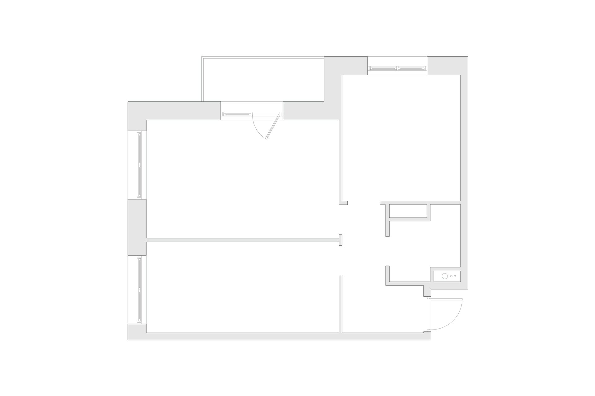
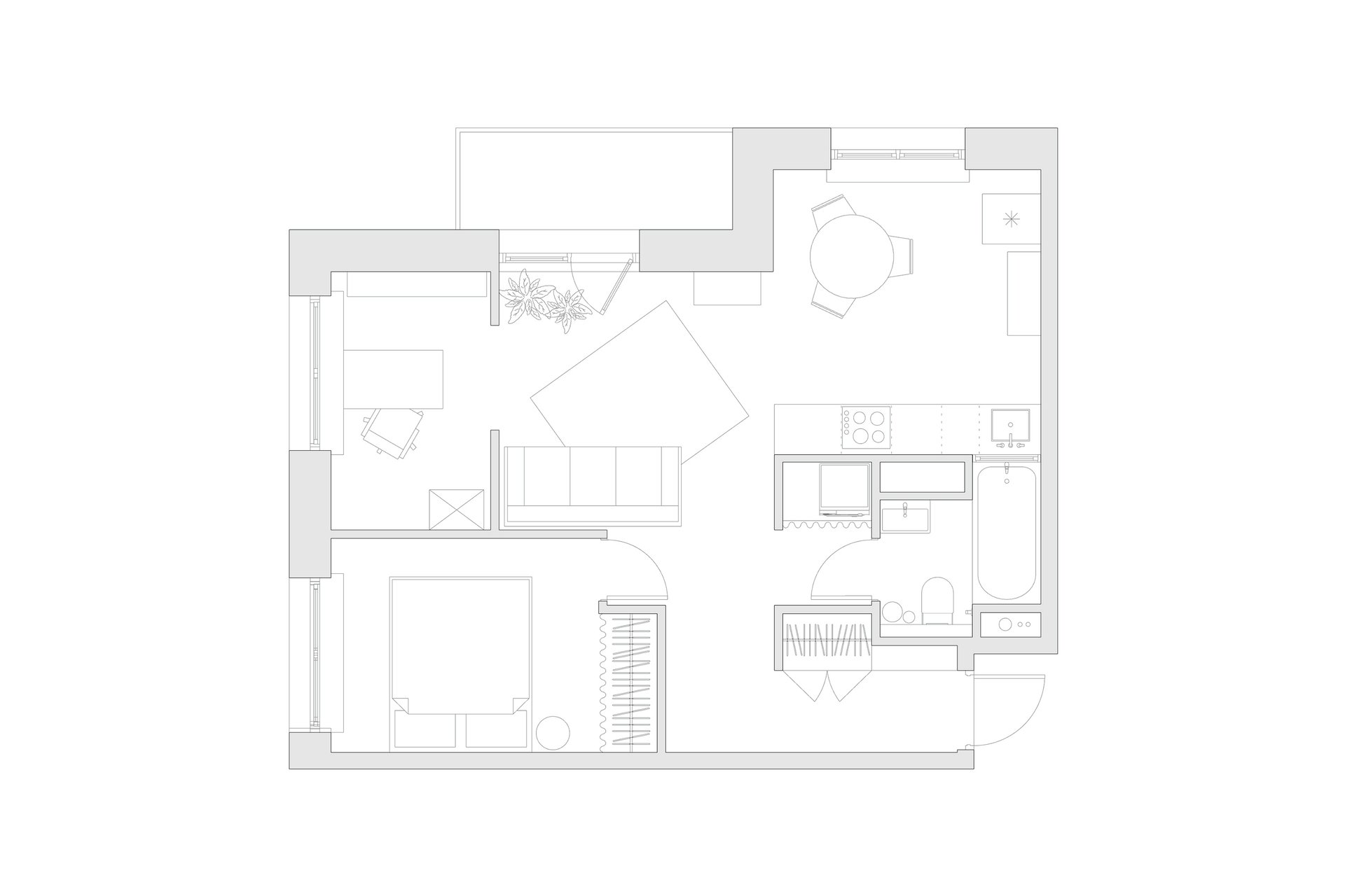
The original floor plan presented an interesting challenge: the apartment’s square shape. The designer turned this into an asset. She kept the kitchen and bathroom in their original locations and completely reconfigured the rest of the space. The apartment now features a bedroom, a small office, a large kitchen-living room, and a laundry room.
The initial idea was simple. It was to create an all-white interior and then gradually fill it with pieces selected one by one over time. This approach requires patience and a clear vision. The designer had no preconceived notions regarding style. She herself describes it as a blend of Scandinavian design, minimalism, and eclecticism, with design-forward accents. An interior that puts bold color and geometric patterns back at the heart of the home.
This choice of a neutral backdrop works well. It avoids the visual overload that often plagues overly cluttered interiors. It’s a choice that can sometimes be risky, as a base that’s too white can end up looking like a showroom if the chosen pieces are mundane. But here, the designer’s professionalism steers clear of that pitfall.
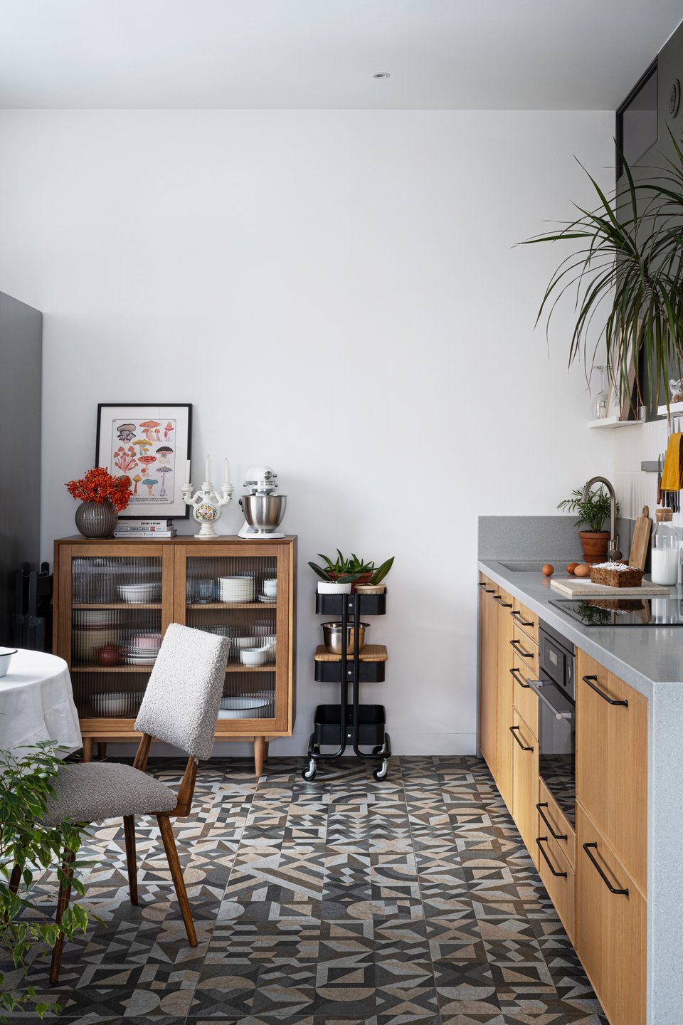
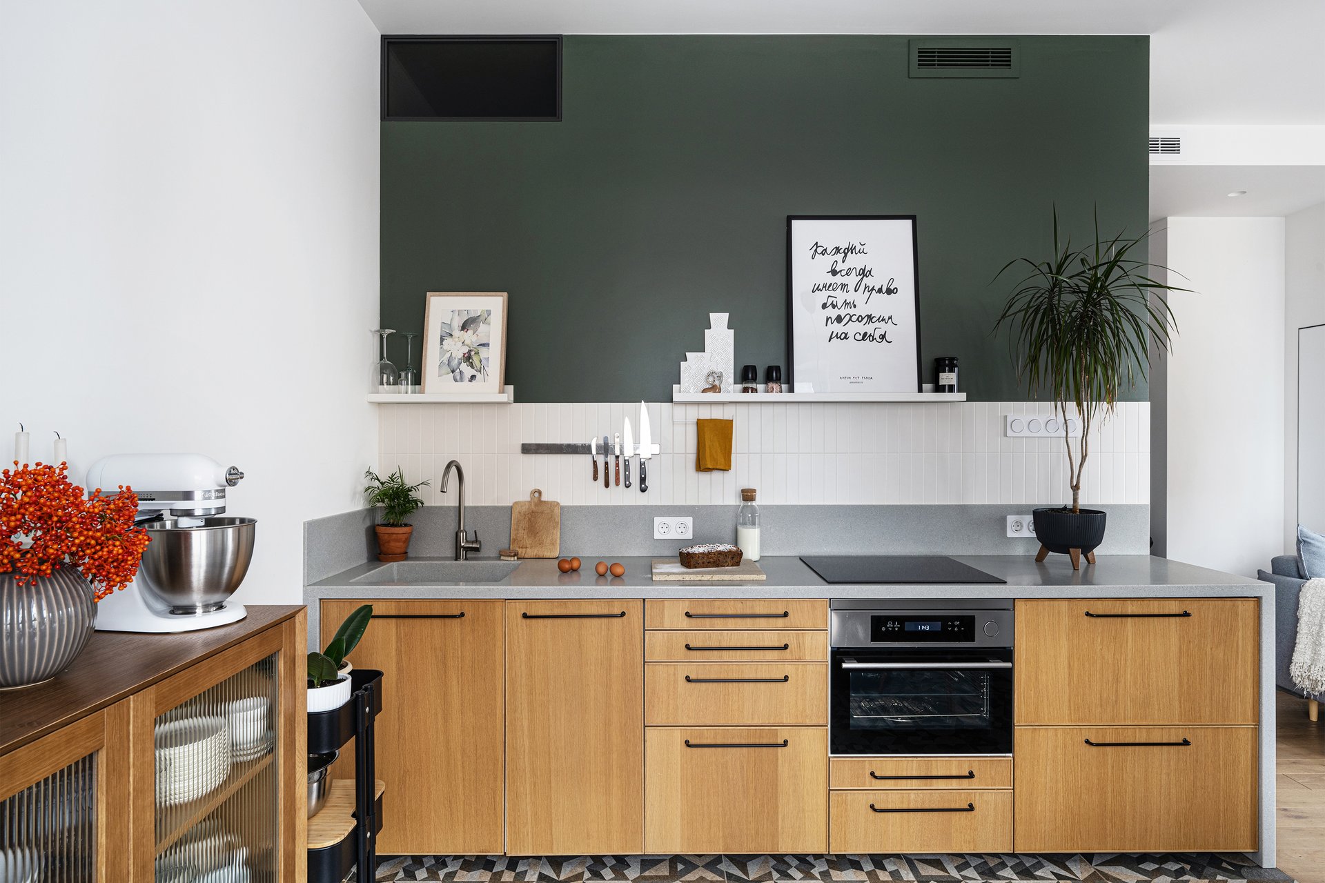
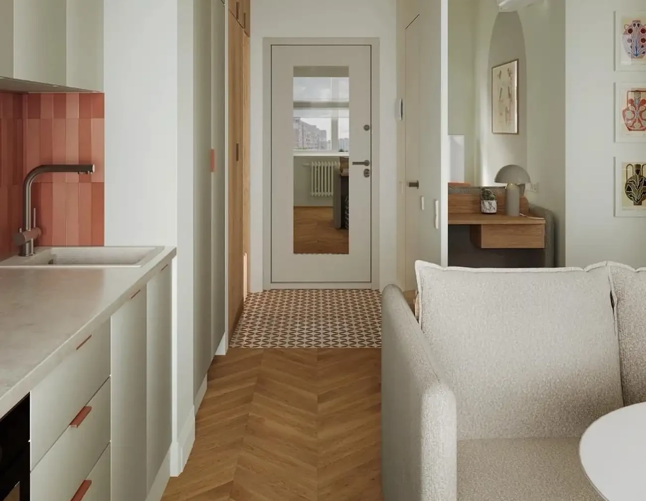
The kitchen floor sets it apart. Its geometric tiles in black, gray, and beige bring a graphic energy that is balanced by the white walls and natural oak cabinet fronts. It’s a bold choice for a small space. Most designers avoid strong patterns on the floor, especially in small areas. Here, the rest of the fairly neutral decor tempers the personality of this floor. The light gray stone countertop, for example, provides a soothing visual contrast.
The solid oak display cabinet with its fluted glass doors immediately catches the eye. It offers an elegant way to store tableware. Stacked bowls, soup plates, and a few dark ceramic pieces come together to create a modern still-life effect.
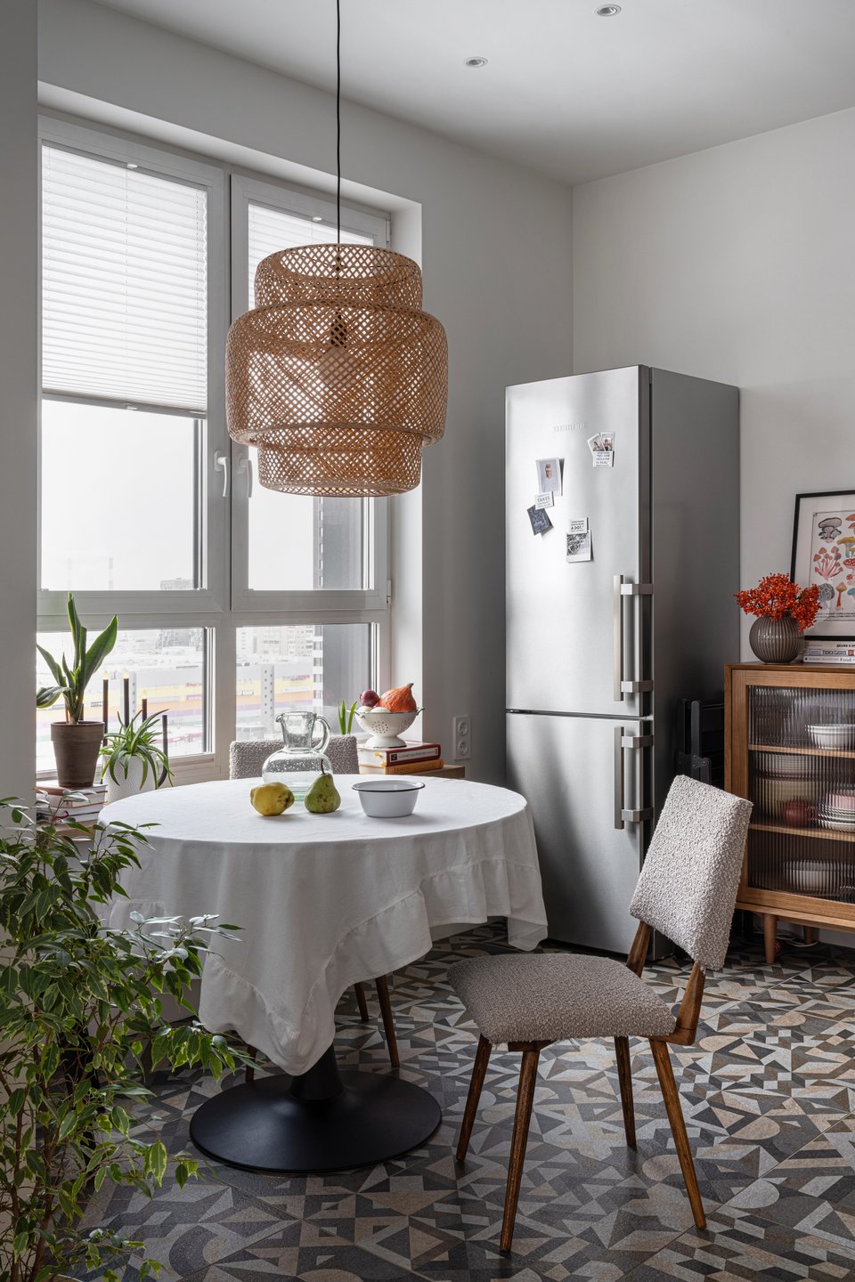
The woven wicker pendant light above the round table illuminates a cozy, bistro-style dining area. Its table with a black central leg, covered with a white linen tablecloth with ruffles, evokes the kitchen tables of a country home. The vintage chairs, reupholstered in gray terry cloth, are comfortable, the light wood of the legs ties in with the countertop’s facades. A black cart on wheels tucked into a corner discreetly holds small kitchen items without cluttering the countertop.
The designer explains that she opted for drawer units in all the lower cabinets, more expensive to build but more practical than 60-cm-deep shelves. Drawers provide easy access to everything without having to rummage through the back of the cabinets.
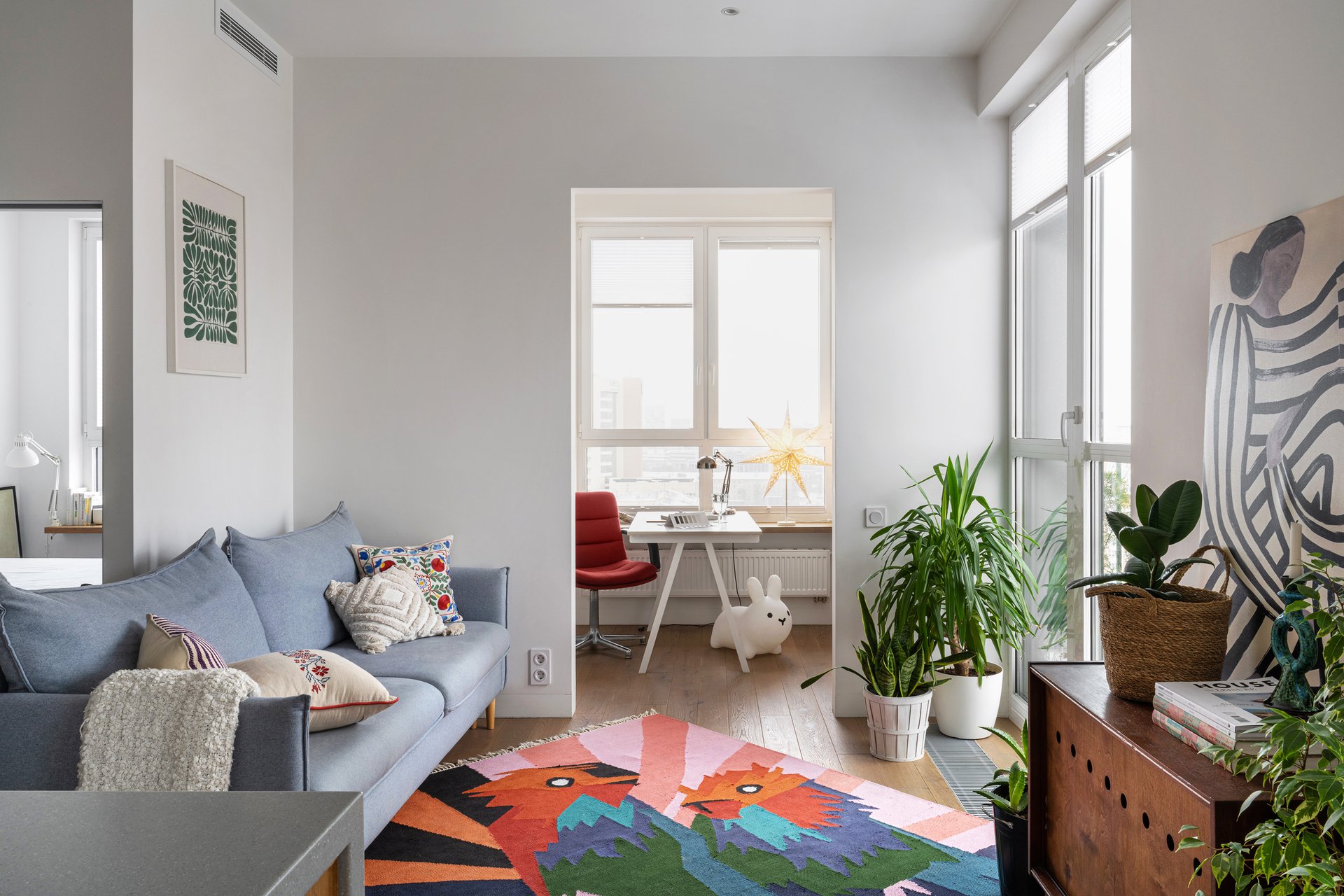
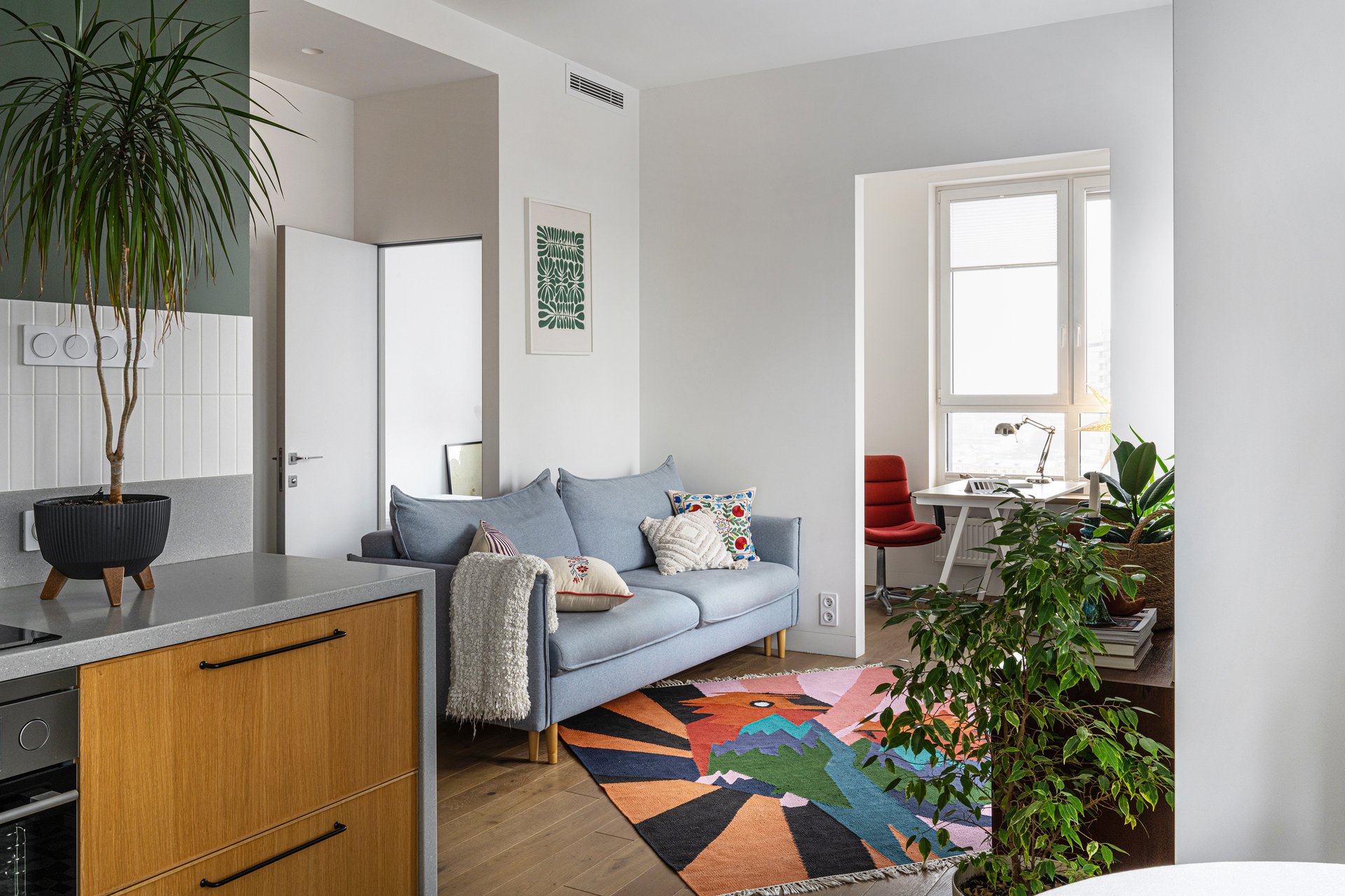
The rug predated the project. Elena Kolomeytseva had bought it before construction began, with the initial idea of hanging it at the head of the bed. It eventually ended up in the living room, and there it stayed. This rug, with its geometric patterns and bold colors, red, orange, pink, black, and green, brings energy to the entire room.
It’s what allows all the disparate elements to coexist, as it contains enough shades to complement every pop of color in the room.
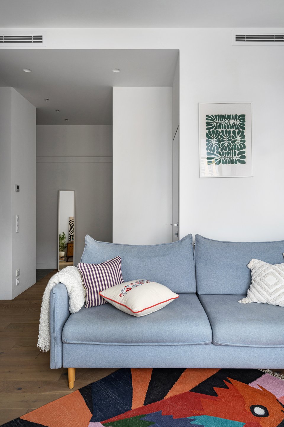
The bluish-gray sofa, understated and well-proportioned for the space, is adorned with a collection of eclectic cushions that tell stories of travels. Floral embroidery from Central Europe, a cushion with a geometric pattern, and another made of textured natural fabric. The designer loves to bring back cushion covers from every destination she visits. A better choice than fridge magnets, don’t you think?
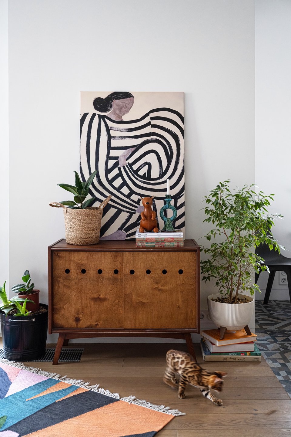
Across from the sofa, a low, dark-wood cabinet with openwork doors serves as a sideboard. On top, you’ll notice decor books stacked horizontally, a blue ceramic sculpture, and a few plants. It’s a retro piece, probably a vintage find, that has a 1960s vintage vibe without being over the top.
The green poster on a white background hanging to the left of the sofa is one of Elena’s creations. She studied at the Academy of Fine Arts for six years and still has a particular fondness for personal artwork. On the opposite wall, a large figurative painting with black lines on a cream background complements her piece.
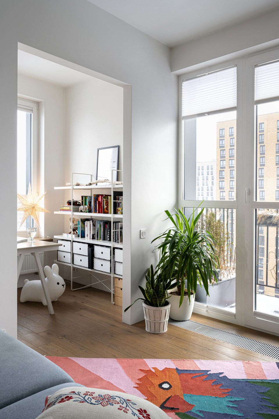
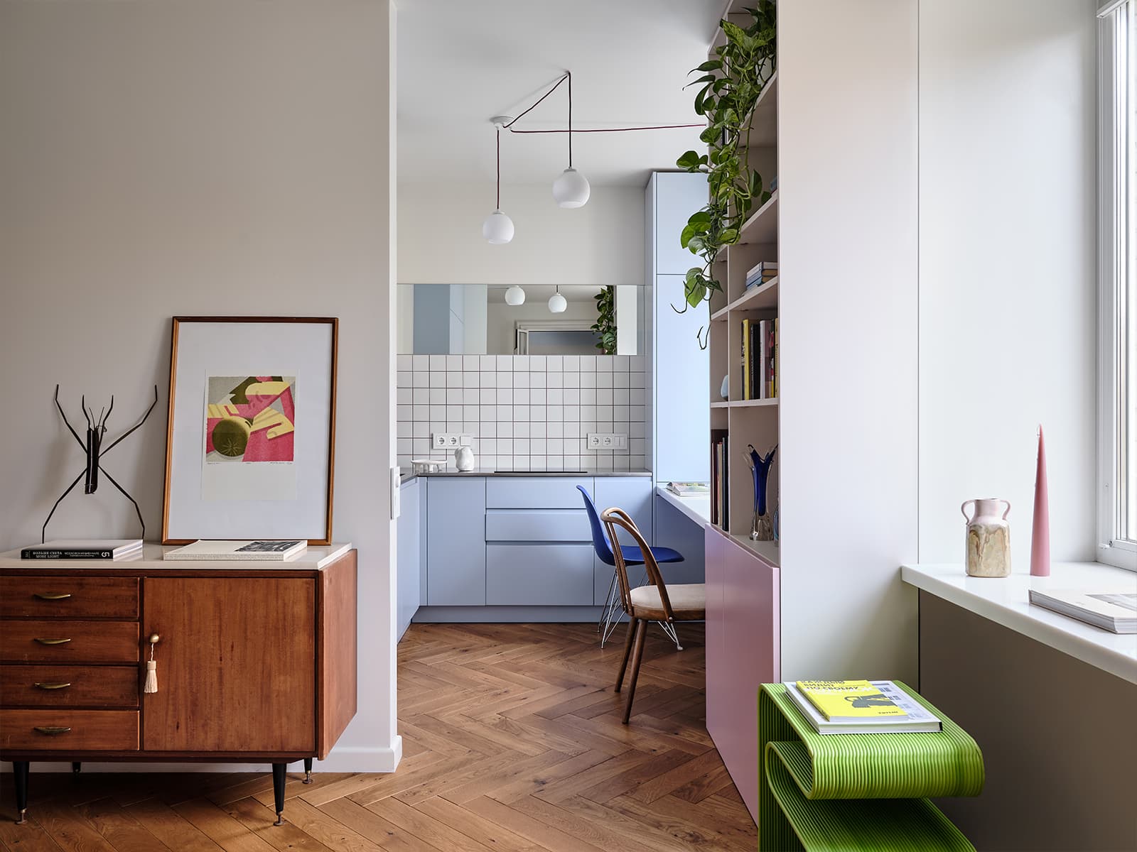
The living room opens onto the office through a wide doorway without a door. From the sofa, you can see the white desk with its red armchair. It’s a bright room thanks to its large window. Thanks to this opening, the living room gains depth, and the office isn’t isolated from the rest of the apartment.
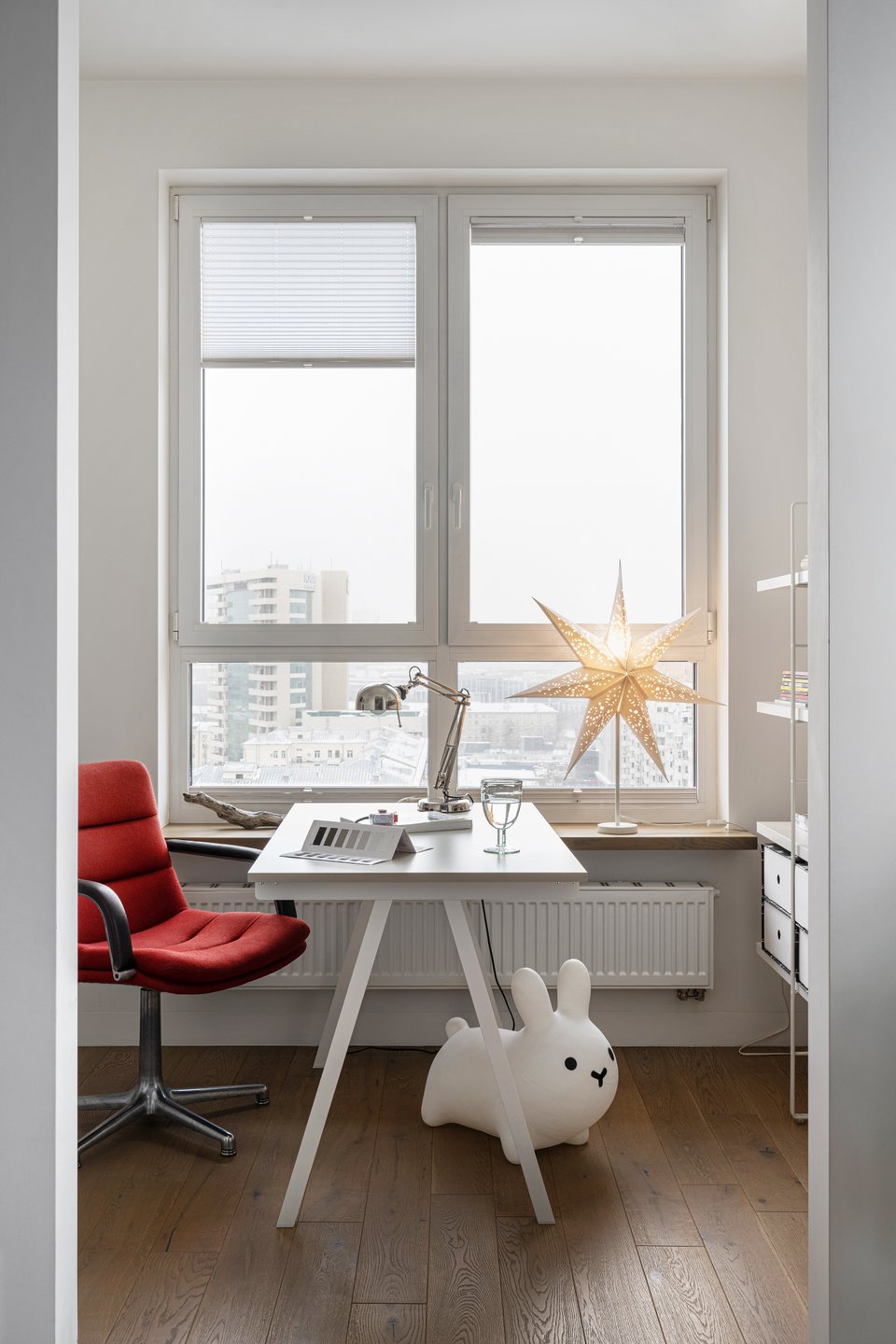
This room is small and organized around a white trestle desk and a red swivel armchair by Artifort. This model, designed by Geoffrey Harcourt in the 1980s and upholstered in its original wool fabric, is a rare find.
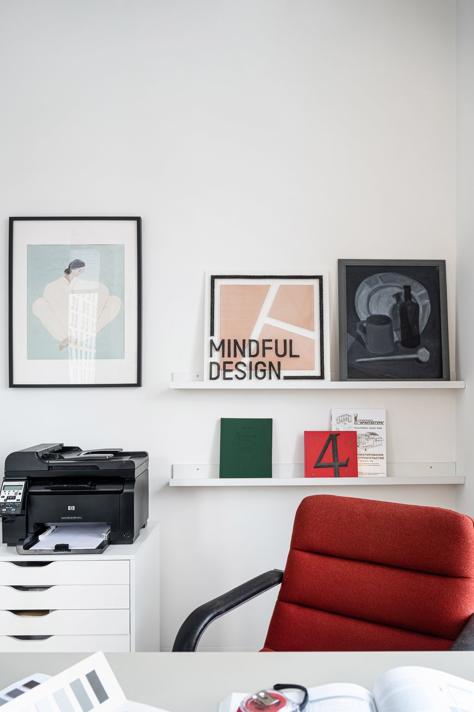
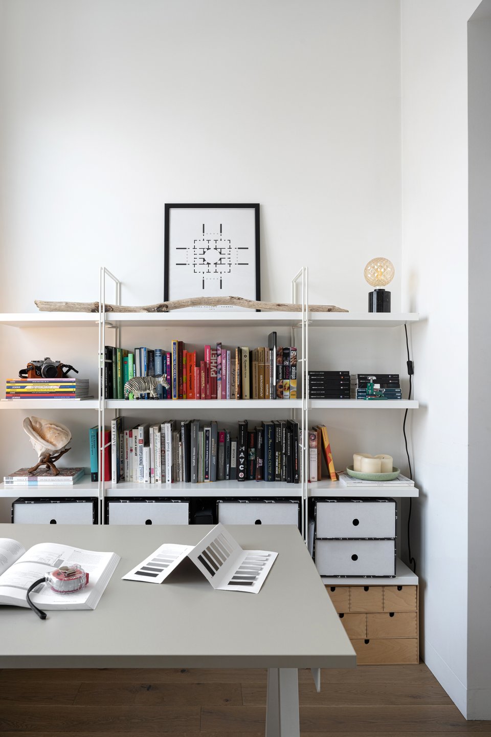
Surrounding it, the books, paintings, and decor change depending on current projects and the mood of the moment. A paper star perched on the windowsill, a small white inflatable rabbit under the desk, quirky touches that counterbalance the seriousness of the workspace.
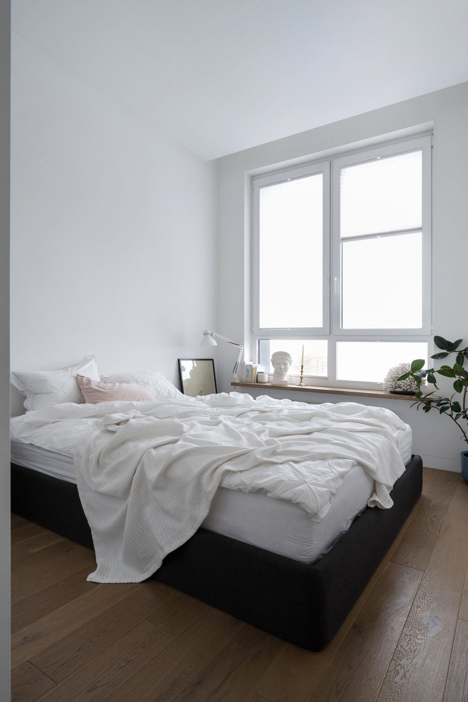
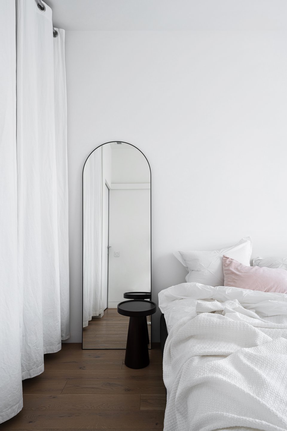
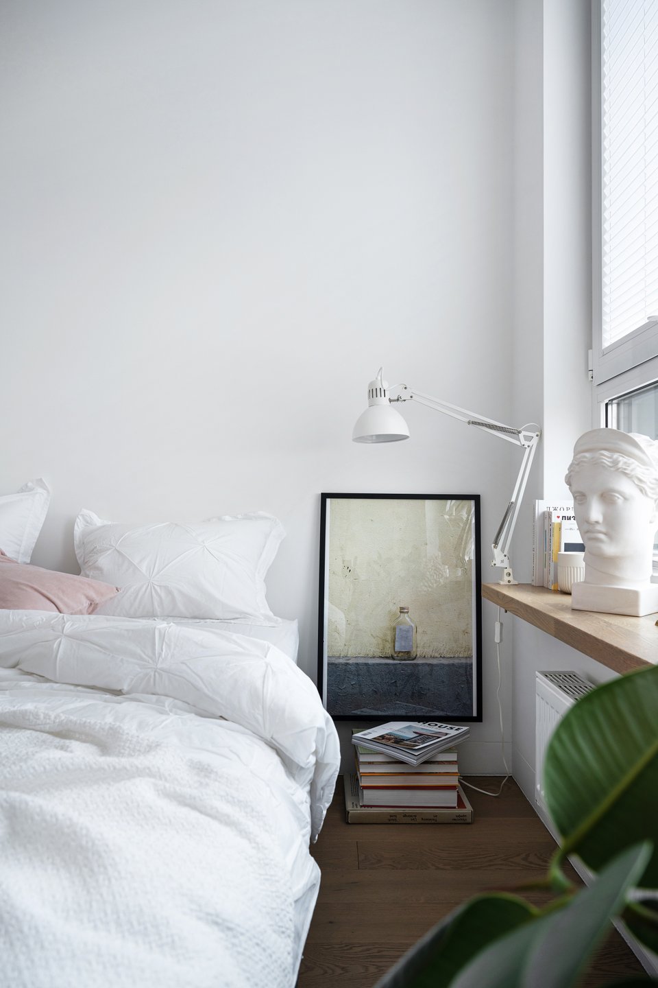
The bedroom is the apartment’s most understated room, by design. A dark bed without a headboard, all-white bedding, a mirror with rounded corners, and a simple bedside lamp come together to create a restful atmosphere. The poster brought back from the Cape Town Museum of Contemporary Art provides the only graphic element, and it’s all that’s needed.
The walk-in closet is enclosed by a curtain rather than hinged doors, a solution that saves space and is both functional and economical. It softens the look of this minimalist bedroom.
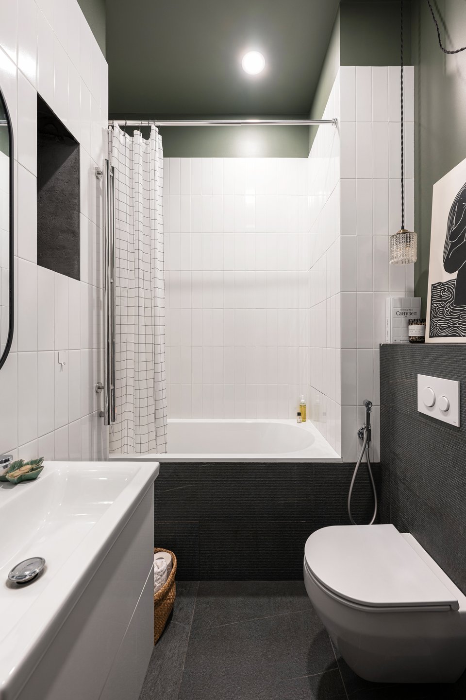
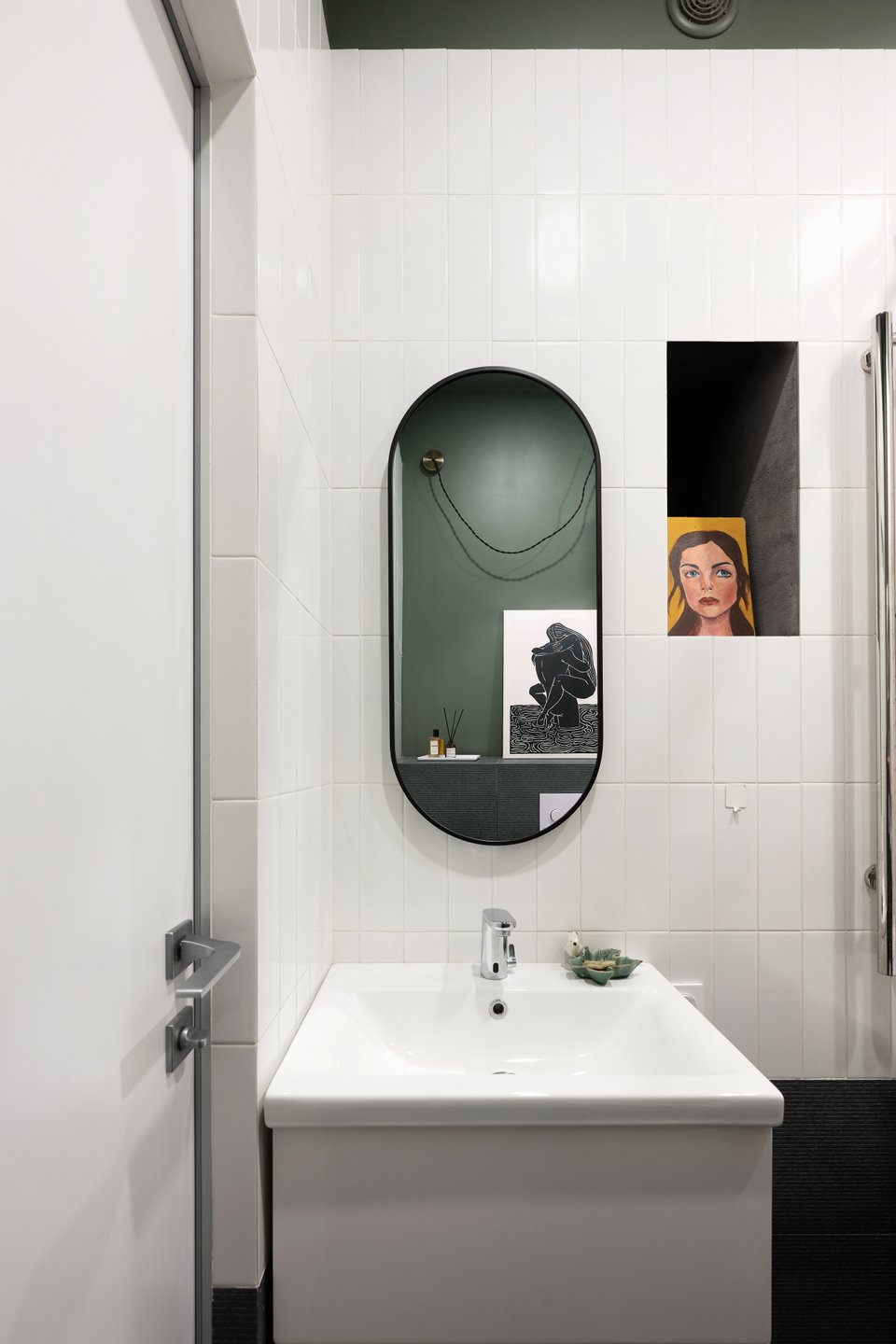
The bathroom maintains a color scheme consistent with the kitchen. Its ceiling features the same deep green that can be seen from the adjacent room through an interior window. The white walls with vertical tiles and the anthracite floor provide a contrast. A painting set in a wall niche and an oval mirror with a black frame complete the room.
First and foremost, it’s a way to make the most of the floor plan, since small apartments are a dime a dozen in every major city around the world. The white backdrop, the vintage finds and souvenirs from travels, the wooden display cabinet with visible tableware, the round table covered with a linen tablecloth, and the imposing plant near a window? these are the elements we can replicate.
The pops of color and geometric patterns bring a contemporary freshness to this 50sqm apartment, whose layout has been optimized. It offers a lesson in organization and proves that it’s often worth reconfiguring a space by removing certain walls, especially in a small space. Even if it seems easier at first to keep the layout as it was delivered by the developer.

Source: Mebel KZ
The original floor plan presented an interesting challenge: the apartment’s square shape. The designer turned this into an asset. She kept the kitchen and bathroom in their original locations and completely reconfigured the rest of the space. The apartment now features a bedroom, a small office, a large kitchen-living room, and a laundry room.
A neutral base for free-spirited decorating
The initial idea was simple. It was to create an all-white interior and then gradually fill it with pieces selected one by one over time. This approach requires patience and a clear vision. The designer had no preconceived notions regarding style. She herself describes it as a blend of Scandinavian design, minimalism, and eclecticism, with design-forward accents. An interior that puts bold color and geometric patterns back at the heart of the home.
This choice of a neutral backdrop works well. It avoids the visual overload that often plagues overly cluttered interiors. It’s a choice that can sometimes be risky, as a base that’s too white can end up looking like a showroom if the chosen pieces are mundane. But here, the designer’s professionalism steers clear of that pitfall.
The kitchen
The kitchen floor sets it apart. Its geometric tiles in black, gray, and beige bring a graphic energy that is balanced by the white walls and natural oak cabinet fronts. It’s a bold choice for a small space. Most designers avoid strong patterns on the floor, especially in small areas. Here, the rest of the fairly neutral decor tempers the personality of this floor. The light gray stone countertop, for example, provides a soothing visual contrast.
The solid oak display cabinet with its fluted glass doors immediately catches the eye. It offers an elegant way to store tableware. Stacked bowls, soup plates, and a few dark ceramic pieces come together to create a modern still-life effect.
The dining area and well-thought-out furnishings
The woven wicker pendant light above the round table illuminates a cozy, bistro-style dining area. Its table with a black central leg, covered with a white linen tablecloth with ruffles, evokes the kitchen tables of a country home. The vintage chairs, reupholstered in gray terry cloth, are comfortable, the light wood of the legs ties in with the countertop’s facades. A black cart on wheels tucked into a corner discreetly holds small kitchen items without cluttering the countertop.
The designer explains that she opted for drawer units in all the lower cabinets, more expensive to build but more practical than 60-cm-deep shelves. Drawers provide easy access to everything without having to rummage through the back of the cabinets.
The living room and its rug
The rug predated the project. Elena Kolomeytseva had bought it before construction began, with the initial idea of hanging it at the head of the bed. It eventually ended up in the living room, and there it stayed. This rug, with its geometric patterns and bold colors, red, orange, pink, black, and green, brings energy to the entire room.
It’s what allows all the disparate elements to coexist, as it contains enough shades to complement every pop of color in the room.
The bluish-gray sofa, understated and well-proportioned for the space, is adorned with a collection of eclectic cushions that tell stories of travels. Floral embroidery from Central Europe, a cushion with a geometric pattern, and another made of textured natural fabric. The designer loves to bring back cushion covers from every destination she visits. A better choice than fridge magnets, don’t you think?
The other pieces of furniture in the living room
Across from the sofa, a low, dark-wood cabinet with openwork doors serves as a sideboard. On top, you’ll notice decor books stacked horizontally, a blue ceramic sculpture, and a few plants. It’s a retro piece, probably a vintage find, that has a 1960s vintage vibe without being over the top.
The green poster on a white background hanging to the left of the sofa is one of Elena’s creations. She studied at the Academy of Fine Arts for six years and still has a particular fondness for personal artwork. On the opposite wall, a large figurative painting with black lines on a cream background complements her piece.
The office
The living room opens onto the office through a wide doorway without a door. From the sofa, you can see the white desk with its red armchair. It’s a bright room thanks to its large window. Thanks to this opening, the living room gains depth, and the office isn’t isolated from the rest of the apartment.
This room is small and organized around a white trestle desk and a red swivel armchair by Artifort. This model, designed by Geoffrey Harcourt in the 1980s and upholstered in its original wool fabric, is a rare find.
Surrounding it, the books, paintings, and decor change depending on current projects and the mood of the moment. A paper star perched on the windowsill, a small white inflatable rabbit under the desk, quirky touches that counterbalance the seriousness of the workspace.
The bedroom
The bedroom is the apartment’s most understated room, by design. A dark bed without a headboard, all-white bedding, a mirror with rounded corners, and a simple bedside lamp come together to create a restful atmosphere. The poster brought back from the Cape Town Museum of Contemporary Art provides the only graphic element, and it’s all that’s needed.
The walk-in closet is enclosed by a curtain rather than hinged doors, a solution that saves space and is both functional and economical. It softens the look of this minimalist bedroom.
The bathroom
The bathroom maintains a color scheme consistent with the kitchen. Its ceiling features the same deep green that can be seen from the adjacent room through an interior window. The white walls with vertical tiles and the anthracite floor provide a contrast. A painting set in a wall niche and an oval mirror with a black frame complete the room.
How can this apartment inspire our interior design?
First and foremost, it’s a way to make the most of the floor plan, since small apartments are a dime a dozen in every major city around the world. The white backdrop, the vintage finds and souvenirs from travels, the wooden display cabinet with visible tableware, the round table covered with a linen tablecloth, and the imposing plant near a window? these are the elements we can replicate.
The pops of color and geometric patterns bring a contemporary freshness to this 50sqm apartment, whose layout has been optimized. It offers a lesson in organization and proves that it’s often worth reconfiguring a space by removing certain walls, especially in a small space. Even if it seems easier at first to keep the layout as it was delivered by the developer.


Source: Mebel KZ


Comments