
A 39sqm studio transformed without tearing down a single wall
This 39sqm studio was transformed using color, a black glass partition, and bold wallpaper, without knocking down a single wall
A retired homeowner bought this 39sqm studio to be closer to her family. She entrusted the project to interior designer Irina Dolganova. The mission could be summed up in one sentence: “Transform everything without major construction.” The budget had to remain tight. Existing floors were kept. No walls were knocked down. The result proves that thoughtful design makes all the difference, even in a limited space.
This apartment includes a main room, a separate kitchen, and a bathroom. The interior designer had to combine the bedroom and living room into a single open space. She also restored character to each room through color and materials. This kind of constraint requires setting priorities from the very beginning. Here, color served as the guiding thread rather than furniture or high-end materials. Here’s how the interior designer went about it, step by step. The decision was made here to keep the kitchen as a separate room without opening it up to the living room.
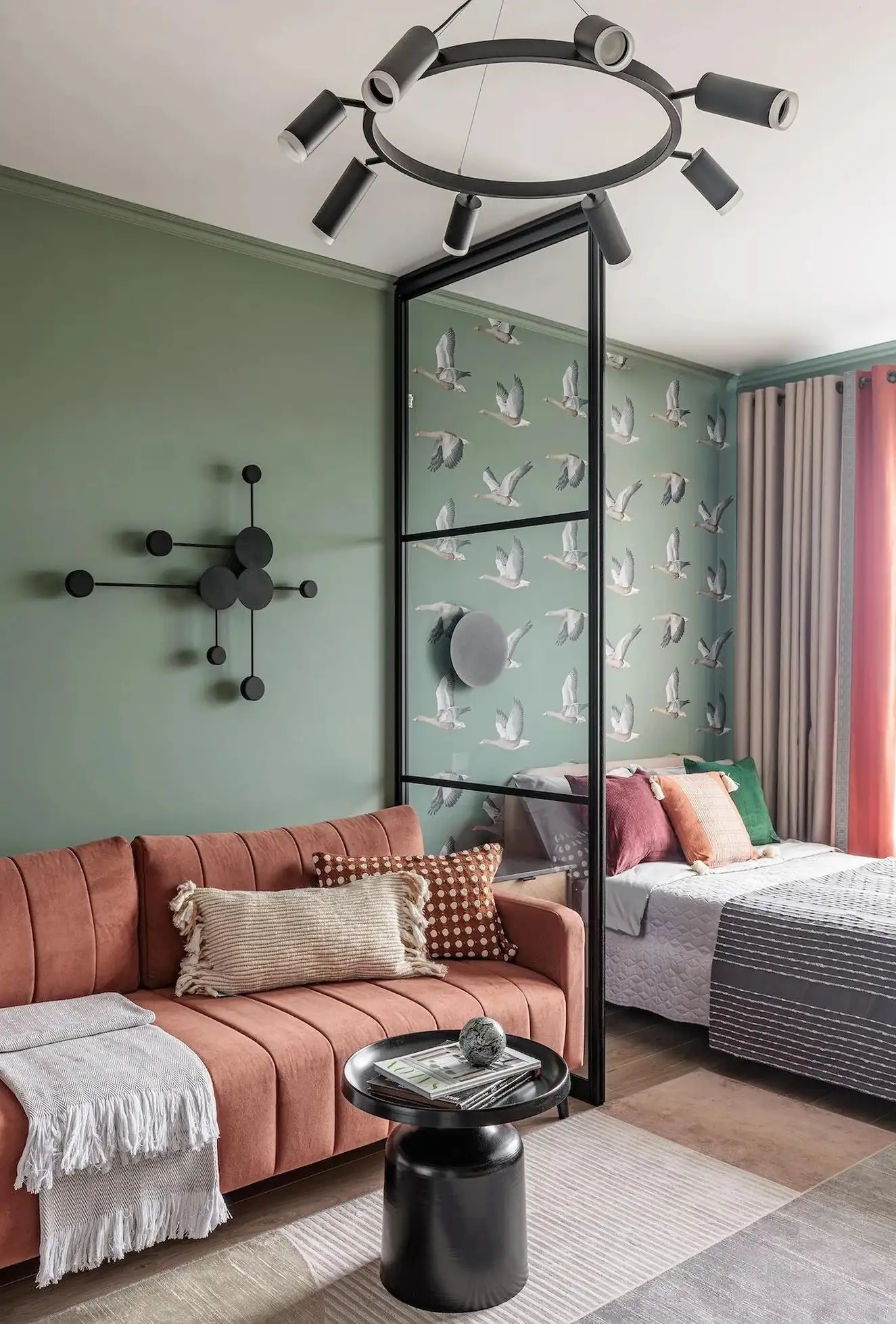
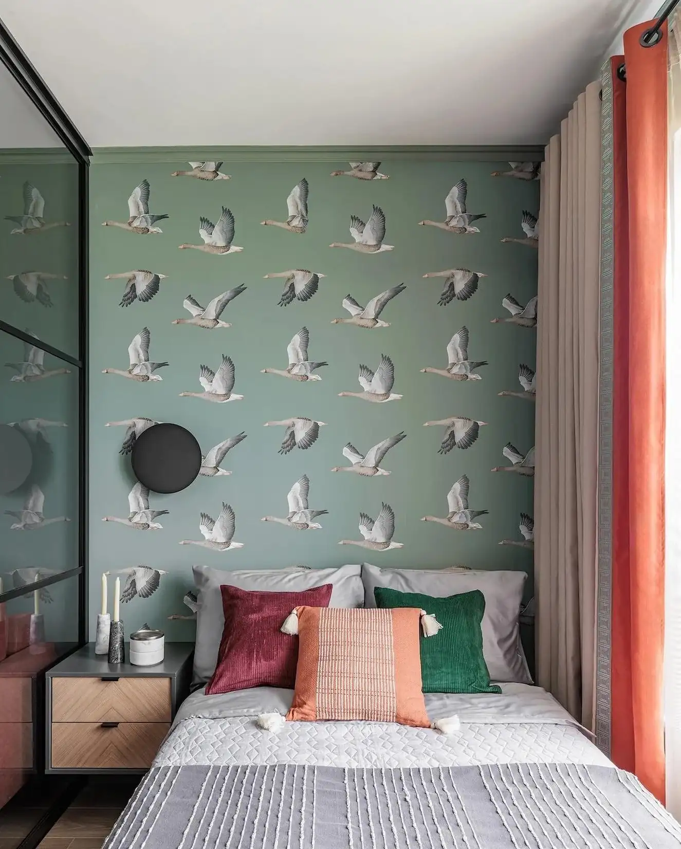
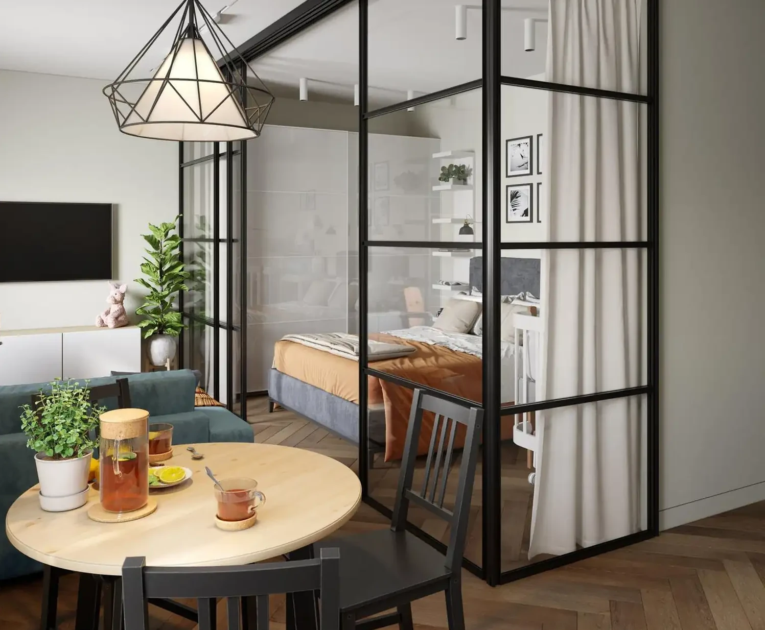
The main room had to serve two functions at once. It functions as both a bedroom and a living room. The interior designer created a division using a glass partition with a black frame. This choice warrants an explanation. A full-height glass partition would have been expensive and would have made the space feel visually heavy. This smaller, almost symbolic version is sufficient to mark the boundary between the two areas.
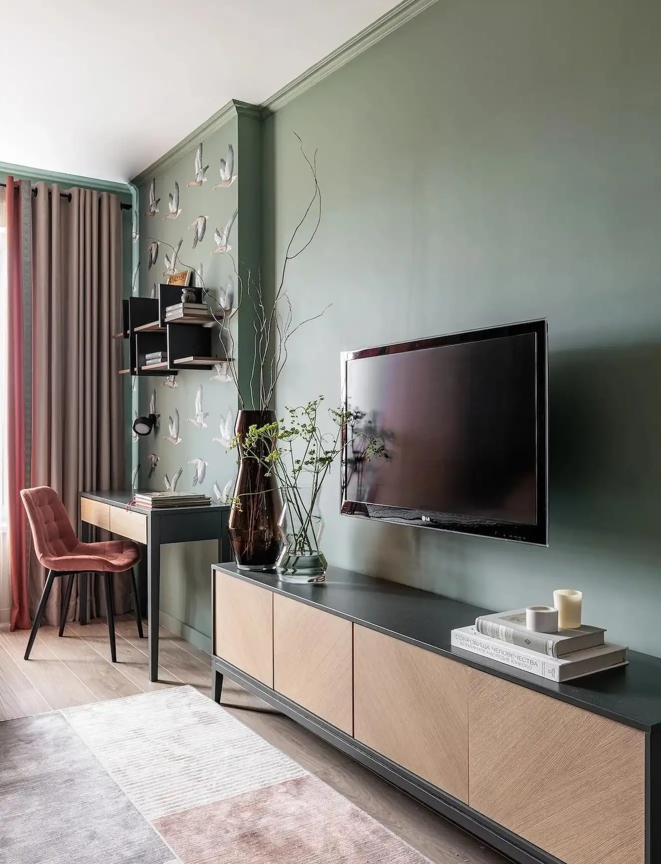
The result works because the transparency allows light to flow freely. The bedroom area benefits from natural light streaming in through the windows. Living room area maintains a more intimate and secluded atmosphere. The black of the frame is then echoed in the light fixtures, wall sconces, and coffee tables. This repetition of the black color creates visual cohesion between the two spaces. This is a simple, replicable example of low-budget zoning.
The glass partition creates a clear visual boundary while preserving the sense of space. It serves as a reminder that transparency remains the most effective ally for small spaces, far more so than a solid partition.
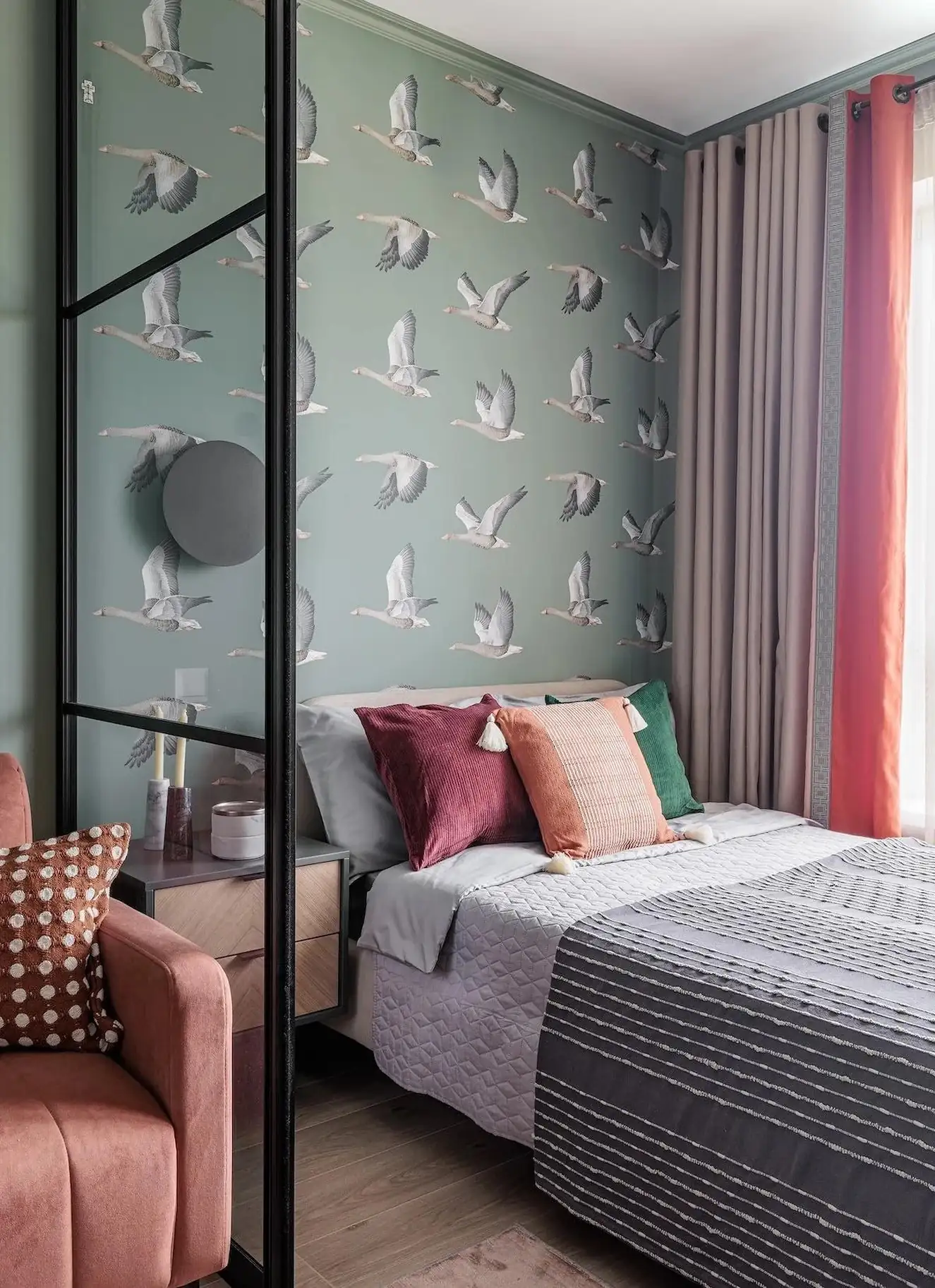
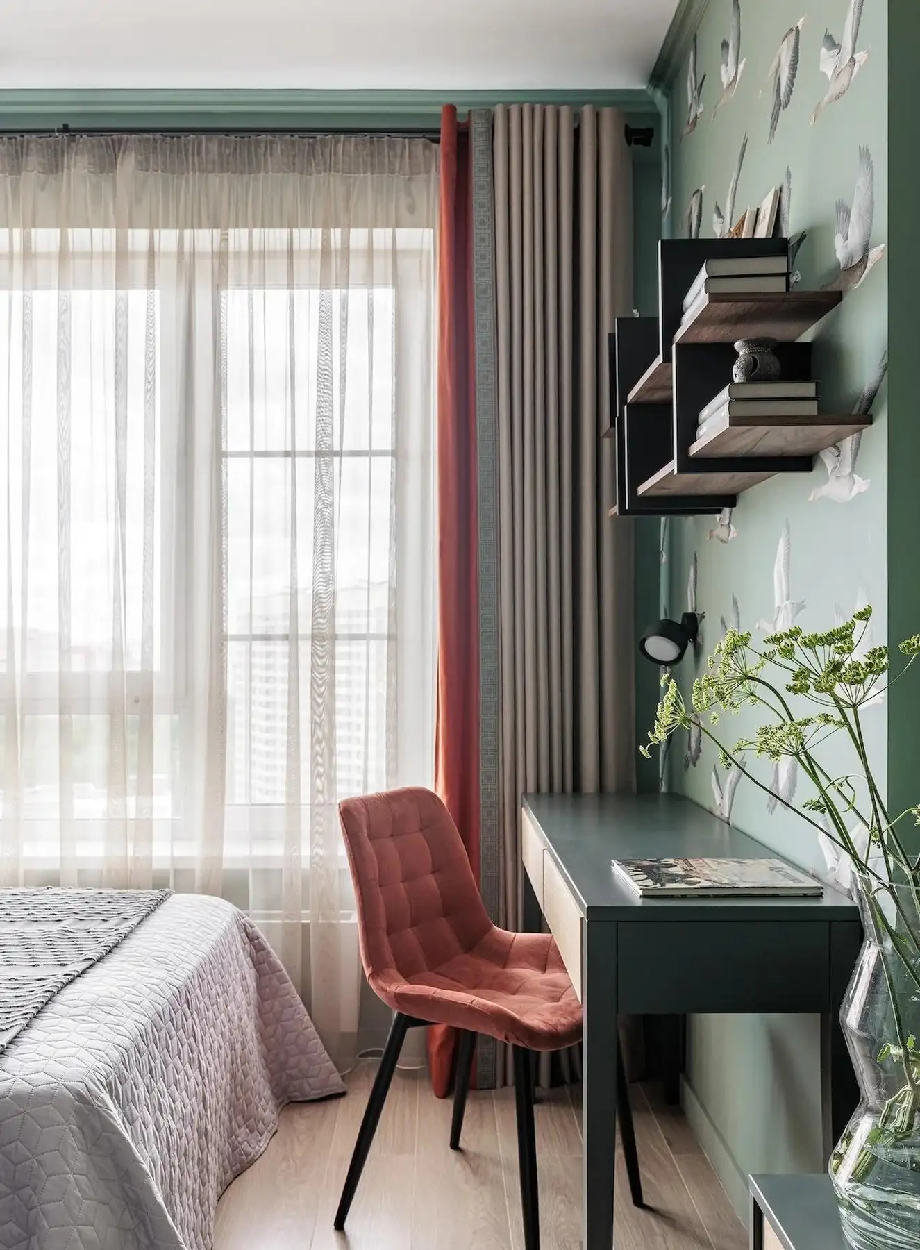
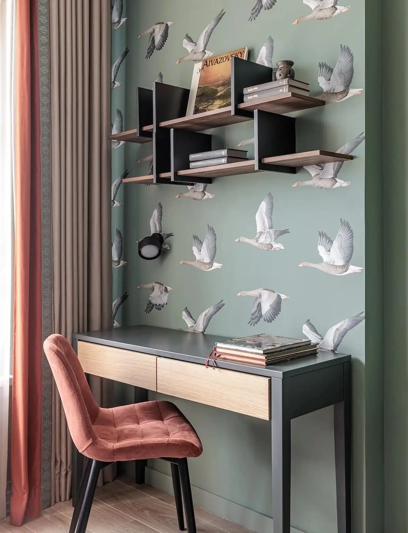
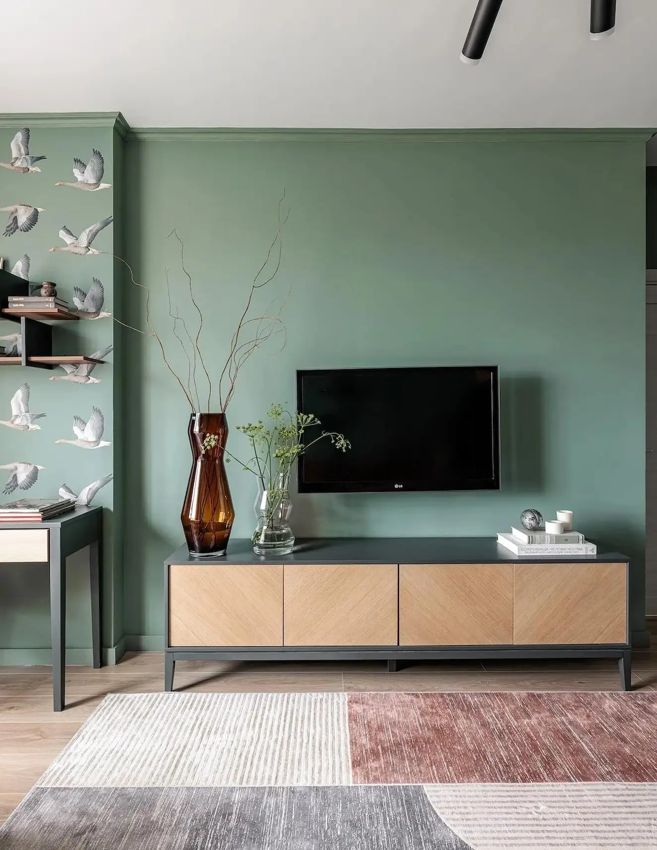
In the sleeping area, wallpaper featuring a pattern of geese in flight adorns the wall behind the headboard. It also appears above the small desk, creating continuity between the two areas of the room. This graphic choice lends an almost theatrical flair, a far cry from the run-of-the-mill choices often found in small homes.
It was precisely this wallpaper that guided the rest of the project. The walls were painted in the exact shade of green found in the pattern. This method, starting with a print to extract a dominant hue, remains one of the surest ways to harmonize a room. The resulting sage green lends a natural softness to the overall look. It avoids the pitfall of uniform white, so common in small spaces renovated on a tight budget.
This method offers another advantage: it limits the number of decisions to be made, thereby reducing the risk of mistakes when working with a tight budget. Once the shade is chosen, it simply needs to be applied to the moldings, the crown molding, and certain pieces of furniture. The result immediately appears more polished than a decor composed of colors chosen separately, room by room, without an overarching design logic.
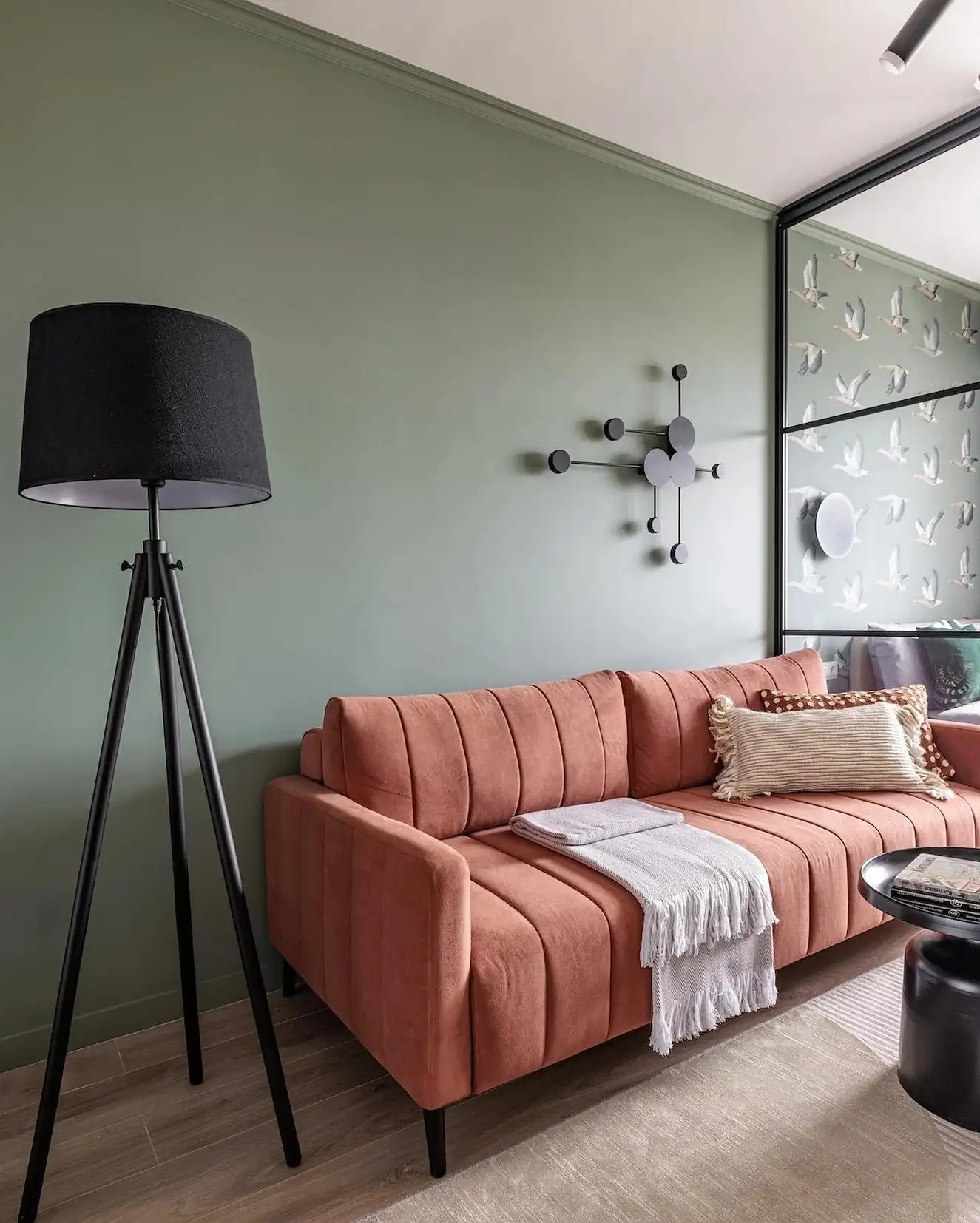
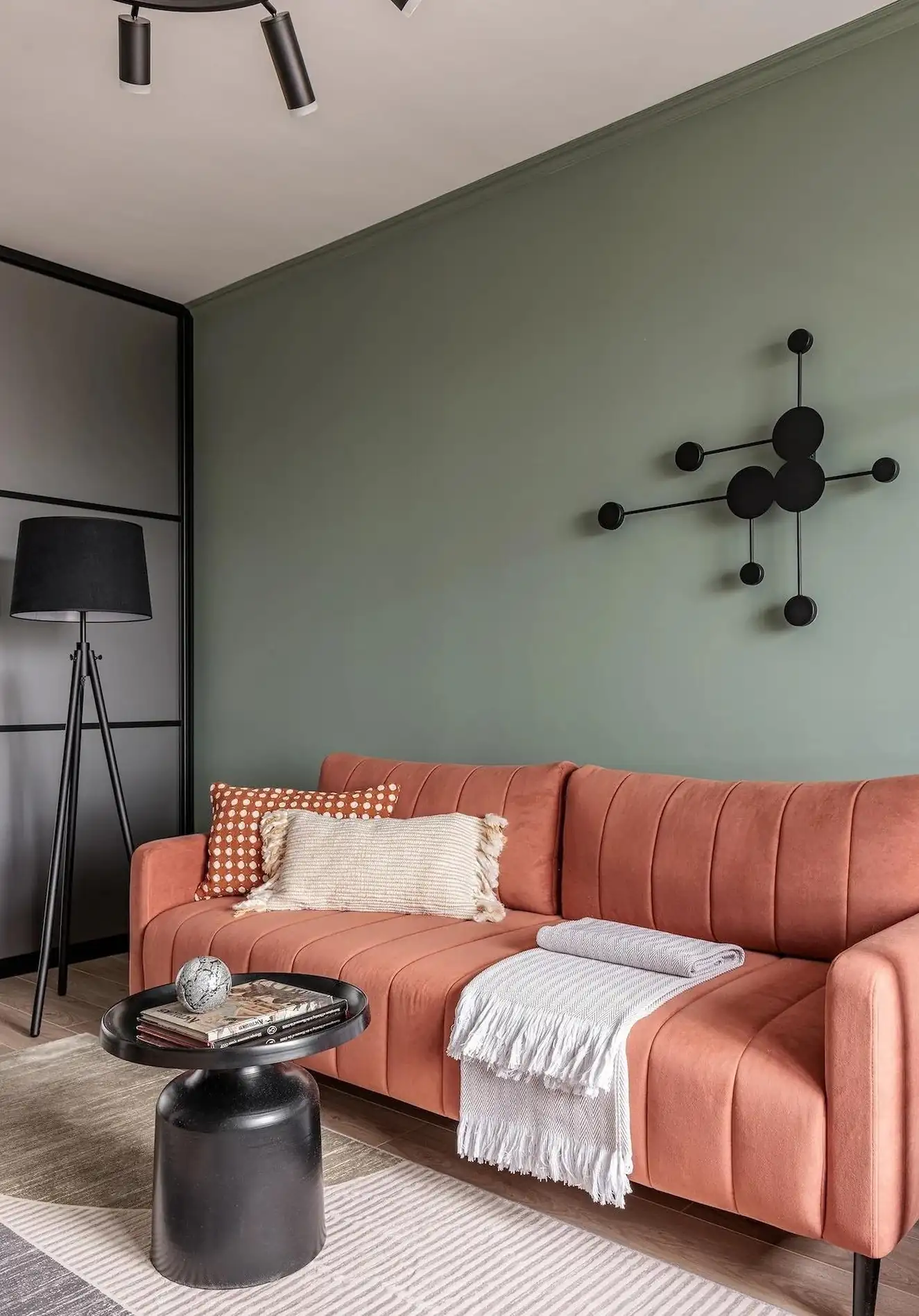
In the living room, a dusty pink velvet sofa immediately catches the eye. Its warm hue contrasts with the sage green of the walls, creating a very harmonious pairing of complementary colors. Cushions with graphic patterns, one polka-dotted, the other striped, add depth to the overall look. A sculptural black wall sconce almost serves as a work of art without breaking the bank.
The old rose warms up the green, which on its own might have seemed cold. The combination also works because the black of the structural elements, the glass roof frame, furniture legs, and light fixtures, contrasts with the colors.
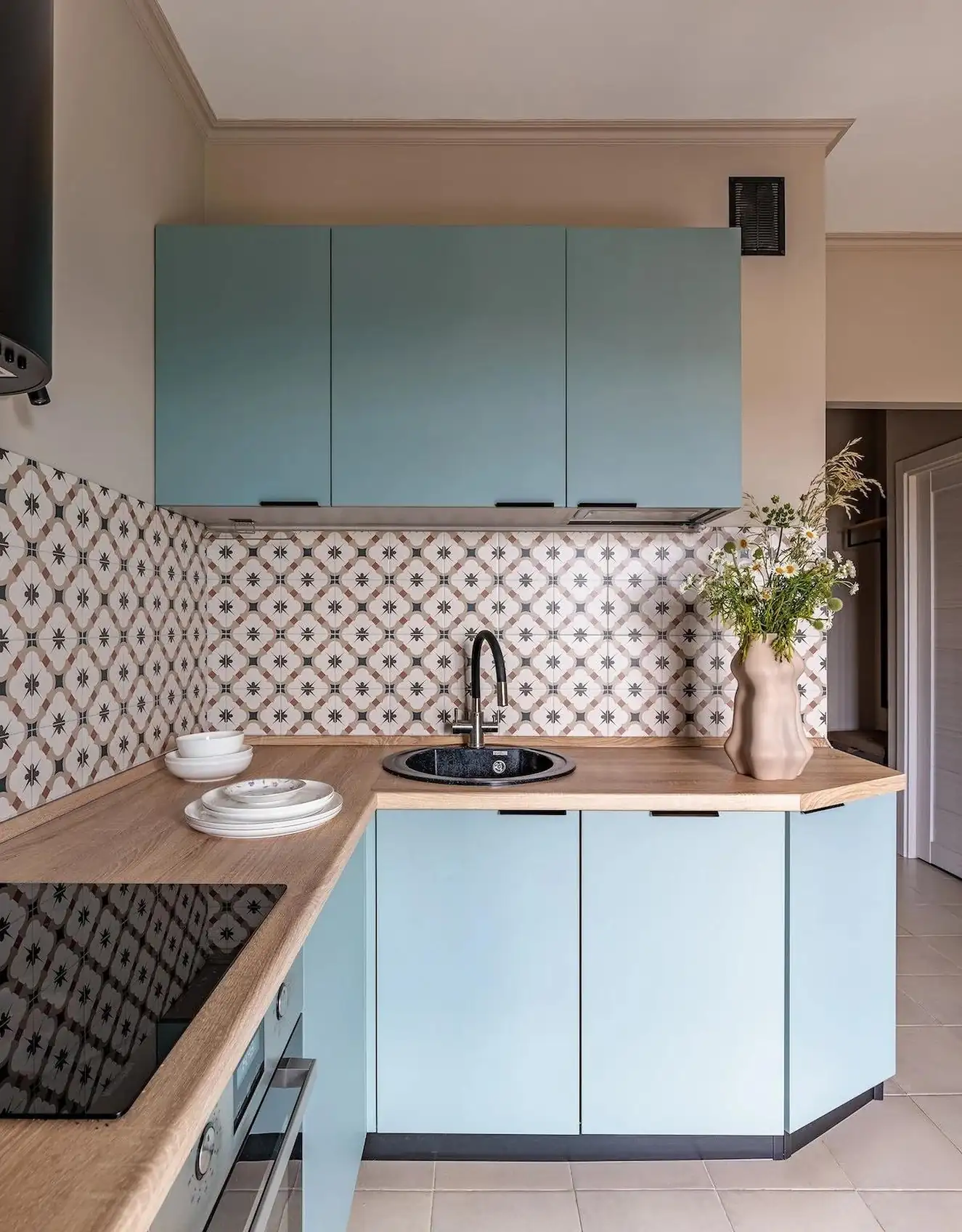
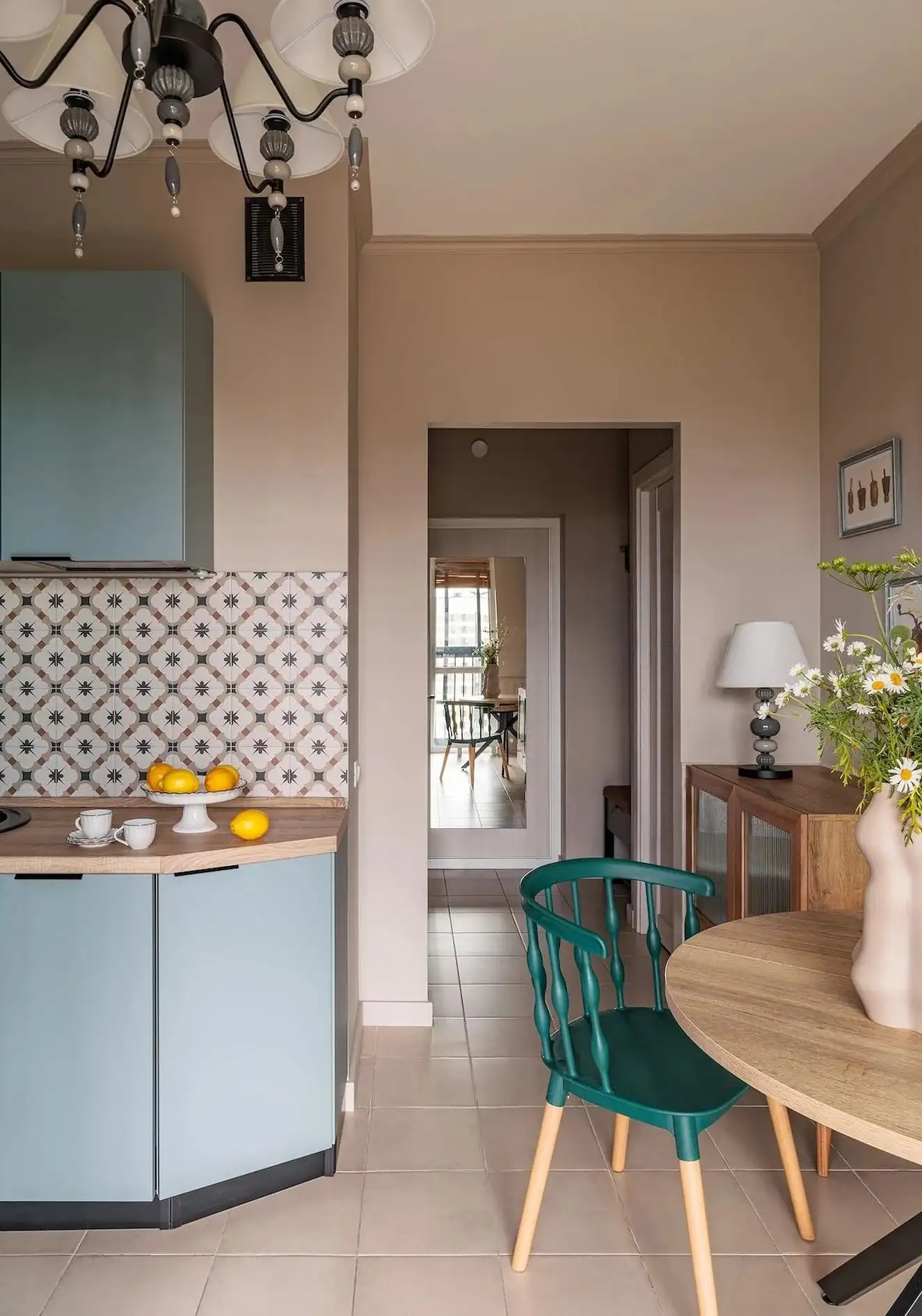
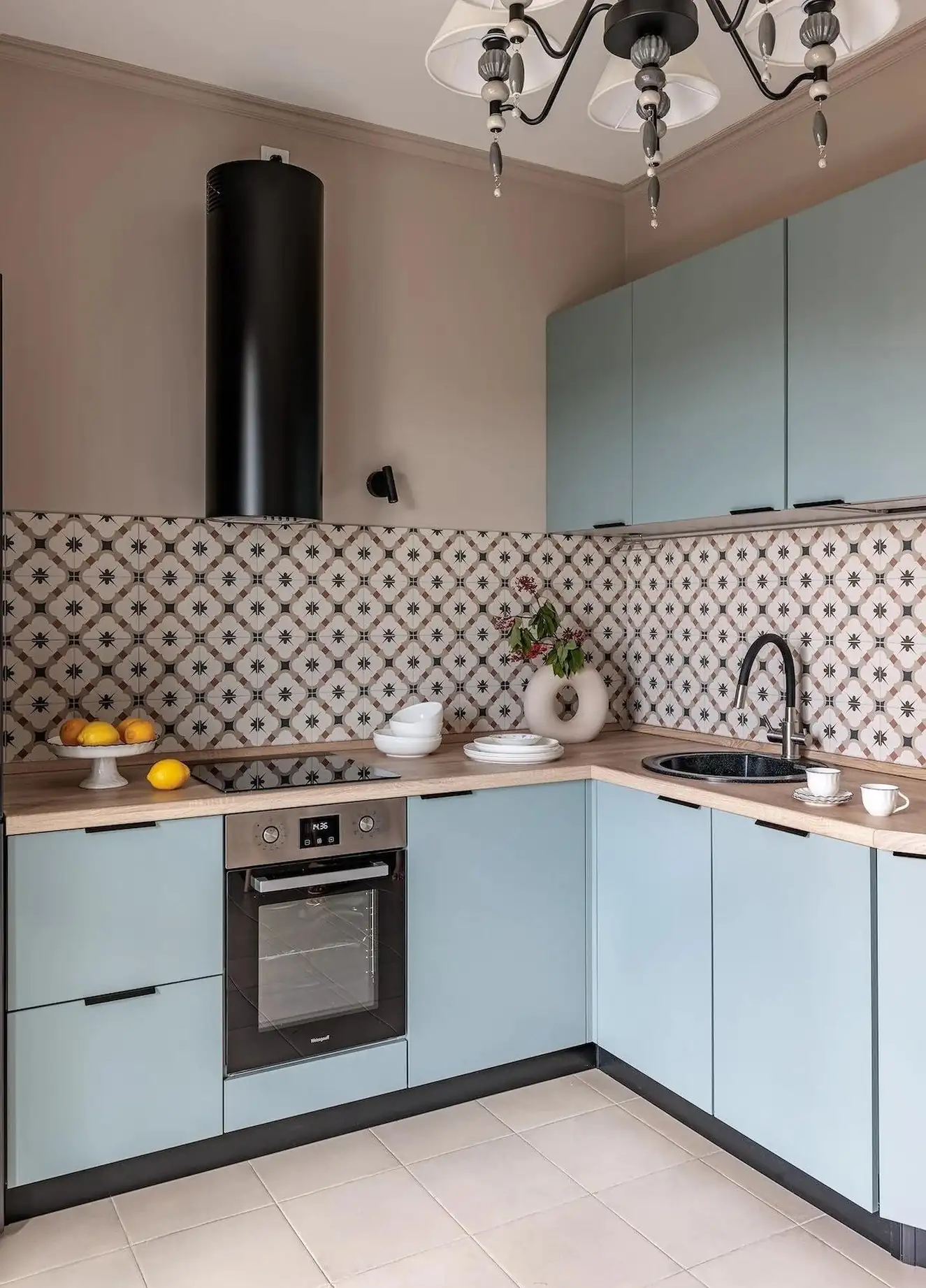
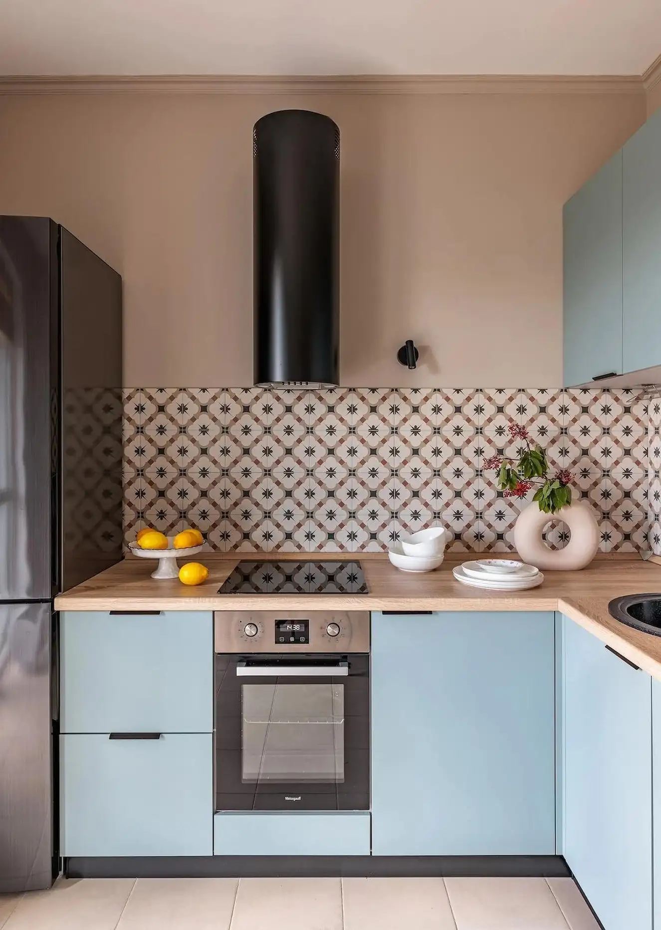
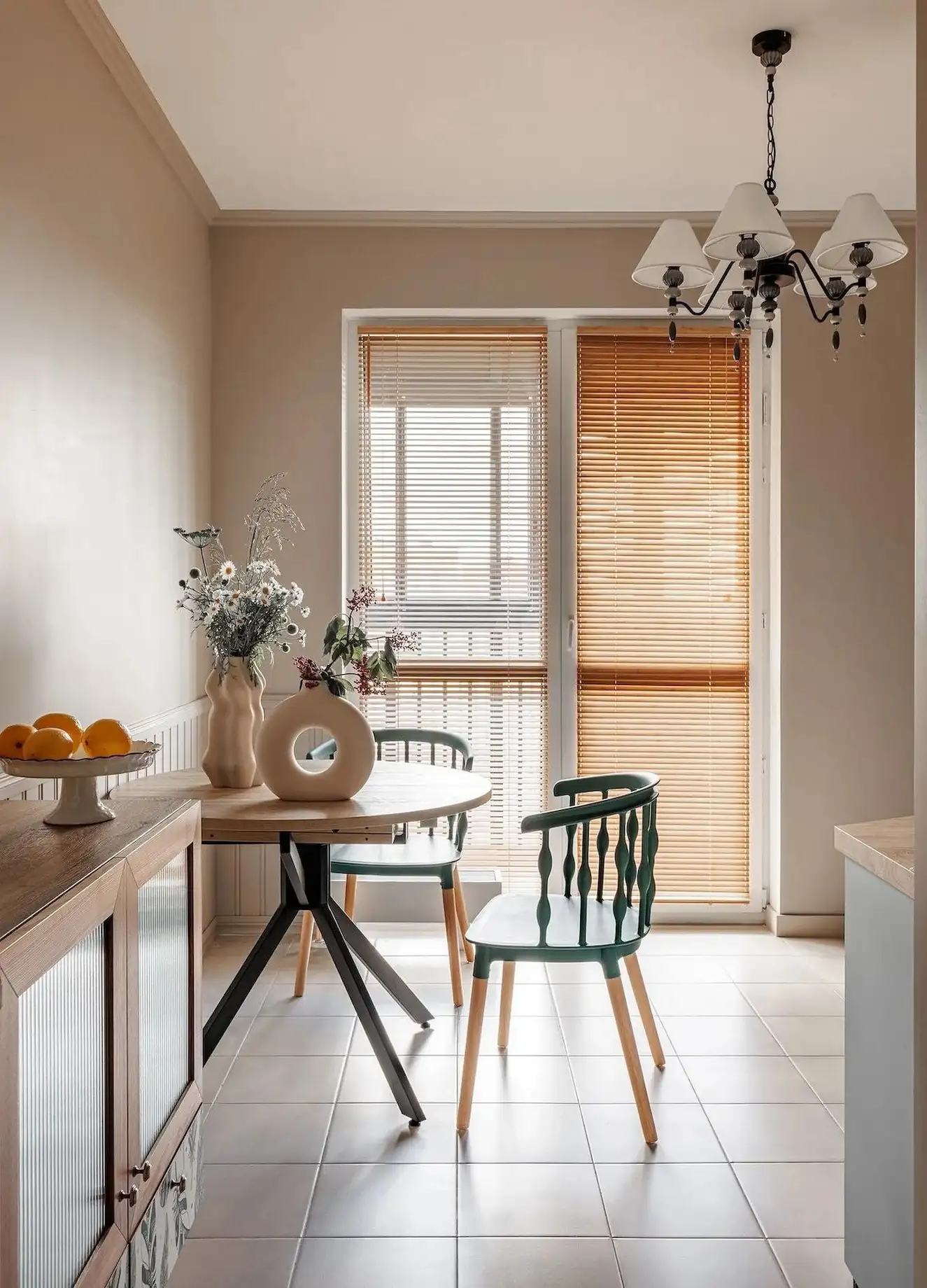
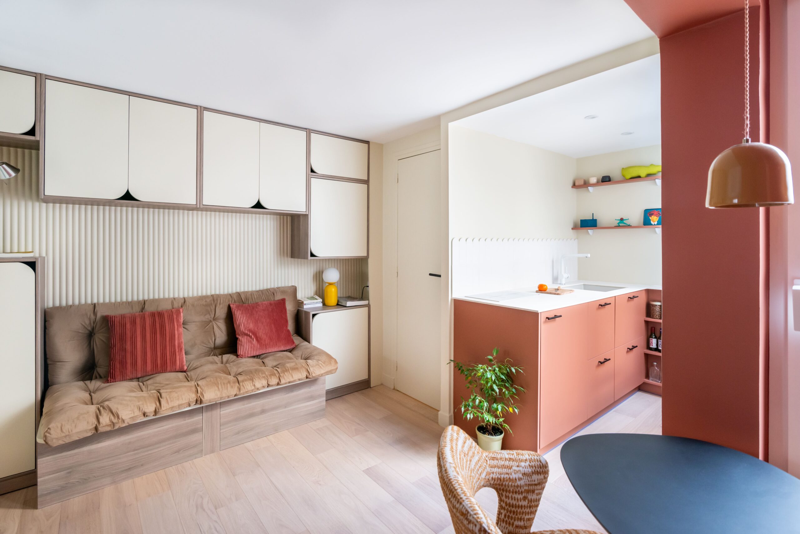
The kitchen is separated from the main room and opens onto the loggia. The base and wall cabinets are painted a soft powder blue. Its light wood countertop was an almost obvious choice. The interior designer decided to remove the wall cabinets above the stovetop. As a result, the room appears significantly larger than it actually is.
The truly unique feature of this kitchen is its backsplash. Colorful tiles with geometric patterns, inspired by retro styles, cover the entire backsplash wall. It’s this detail that gives the room its distinct character.
This type of graphic backsplash is a surefire way to liven up a small kitchen. It catches the eye without requiring major renovations or changing the countertop. Paired with a pastel shade like this powder blue, it prevents a monochromatic kitchen from looking too plain. It’s a simple lesson to remember for anyone who wants to refresh an existing kitchen without starting from scratch.
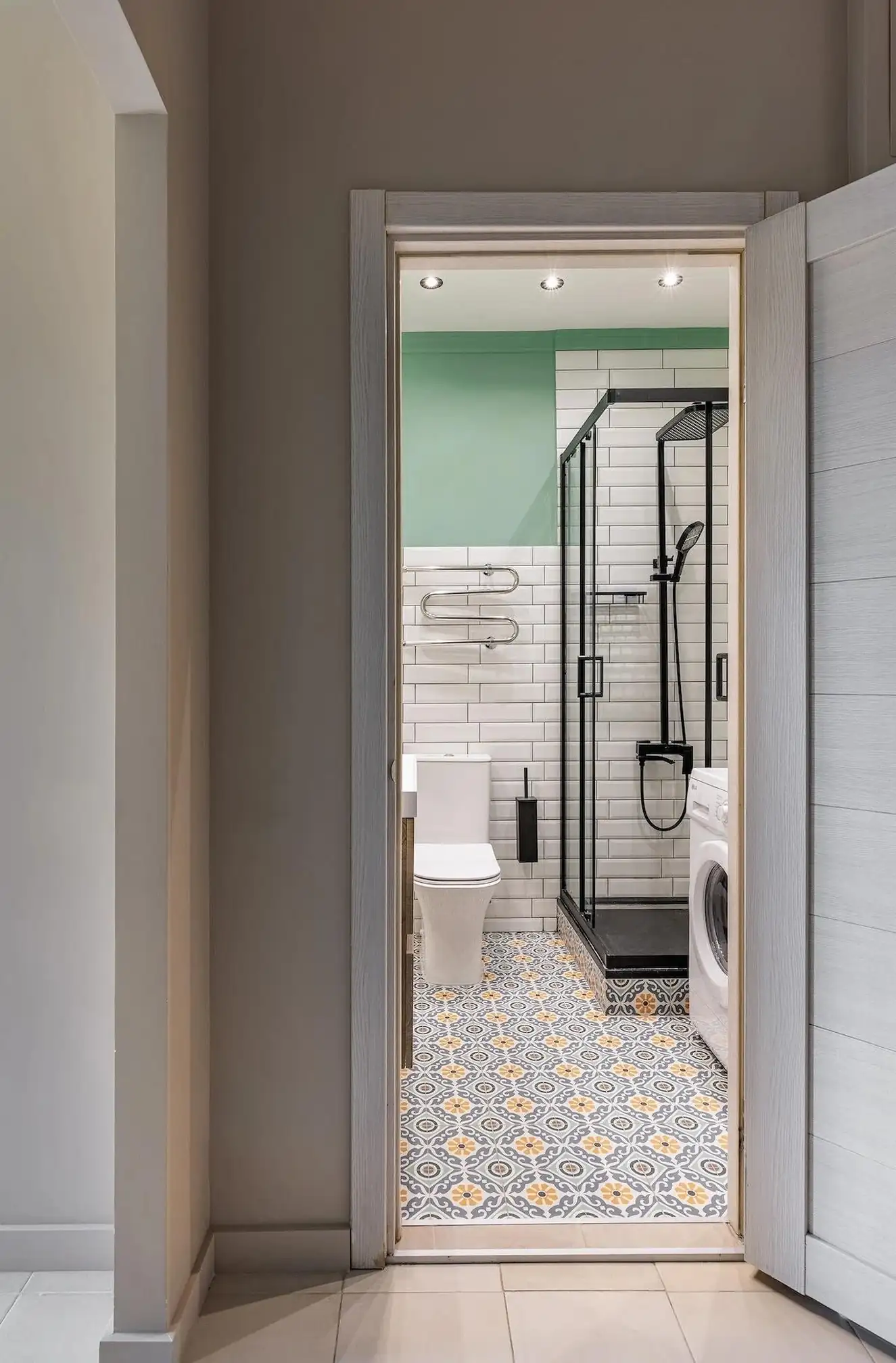
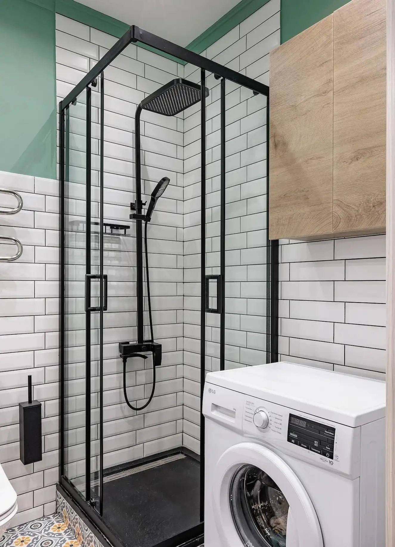
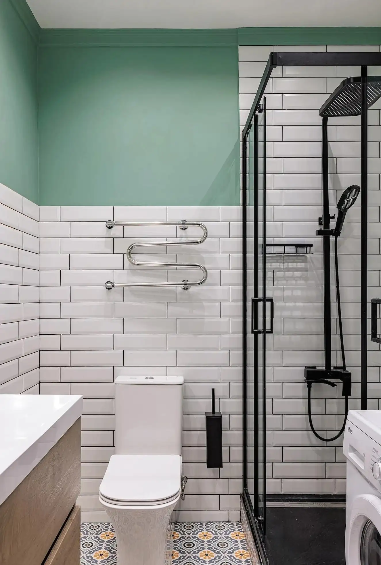
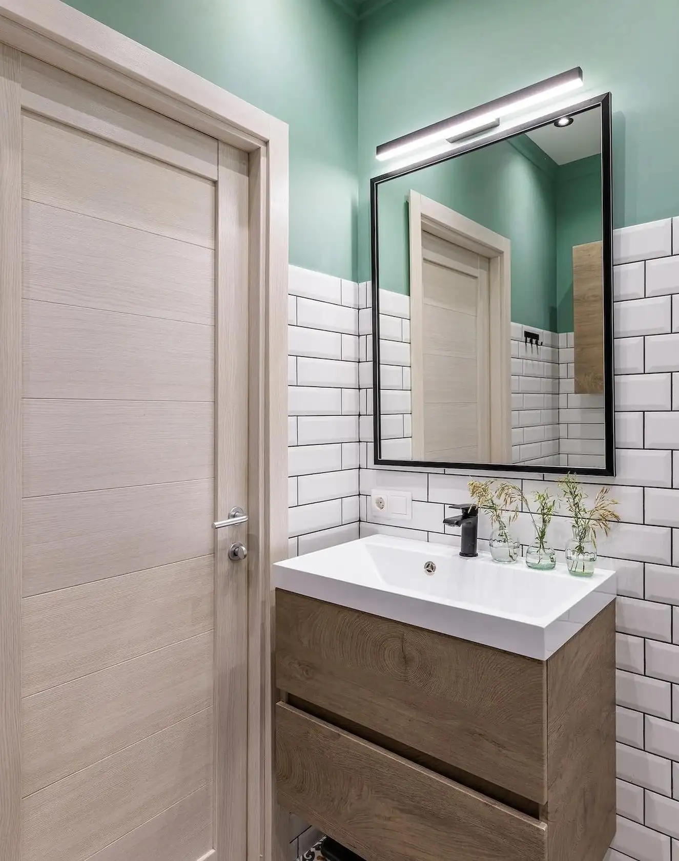
The bathroom is the only space where the renovation was carried out in its entirety. A drop ceiling, recessed spotlights, white subway tiles, and a floor with a graphic pattern make up the new design. The bathtub has been replaced by a walk-in shower, framed in black, which is more practical for everyday use. This design choice makes perfect sense in a studio apartment intended for a single person, especially an older one.
Green reappears on the upper portion of the walls, directly echoing the rest of the apartment. This repetition of color creates continuity between the rooms, even though they are physically separate. The combination of classic subway tiles and a more contemporary patterned floor works well. It avoids the overly sterile look of a standard new bathroom, while remaining timeless.
The choice of a shower over a bathtub is also worth noting. It frees up floor space and makes it easier to move around in an already compact room. The black frame of the glass shower enclosure echoes the design language introduced by the living room’s glass roof. This continuity of materials, though subtle, reinforces the sense of a project thoughtfully designed as a whole.
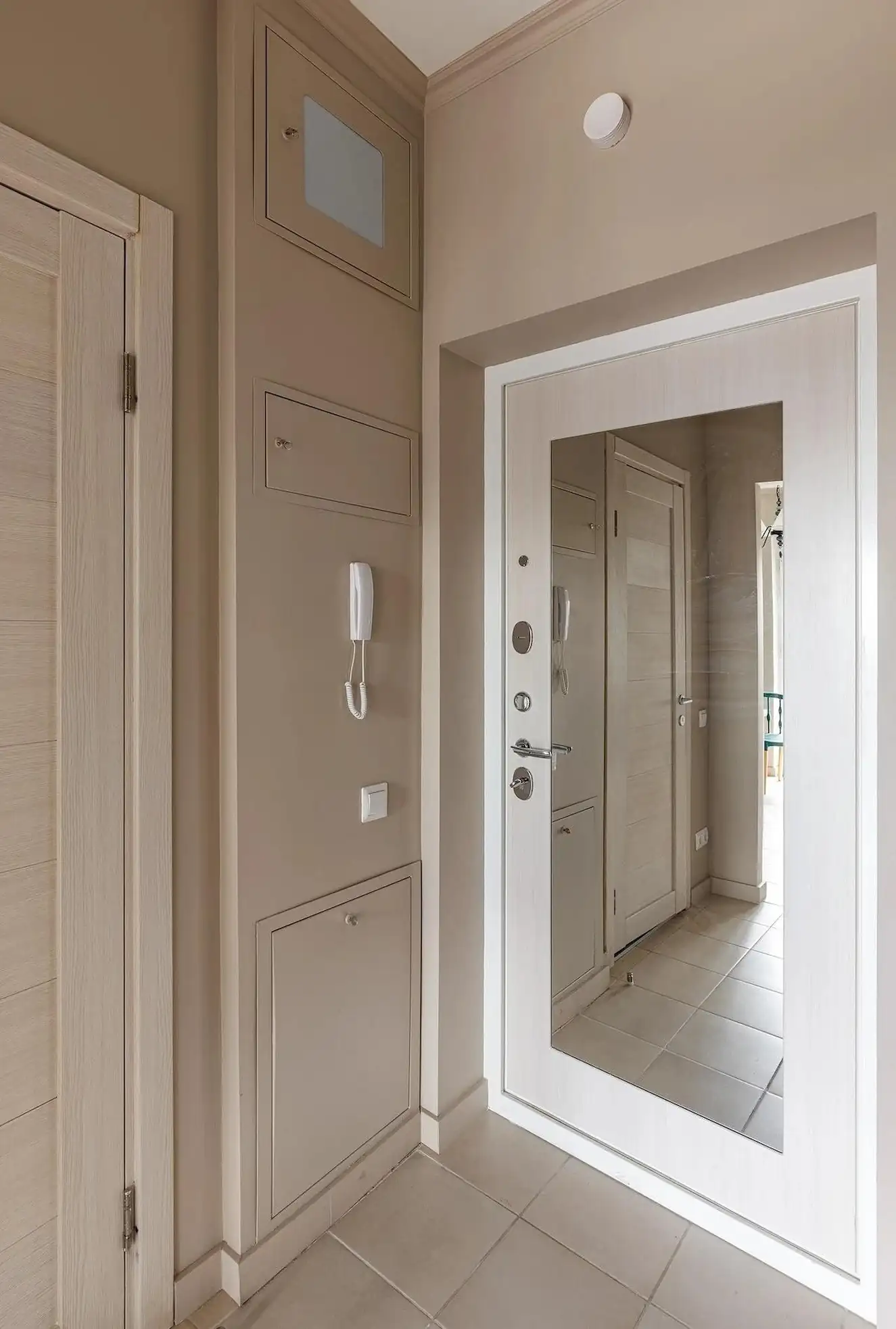
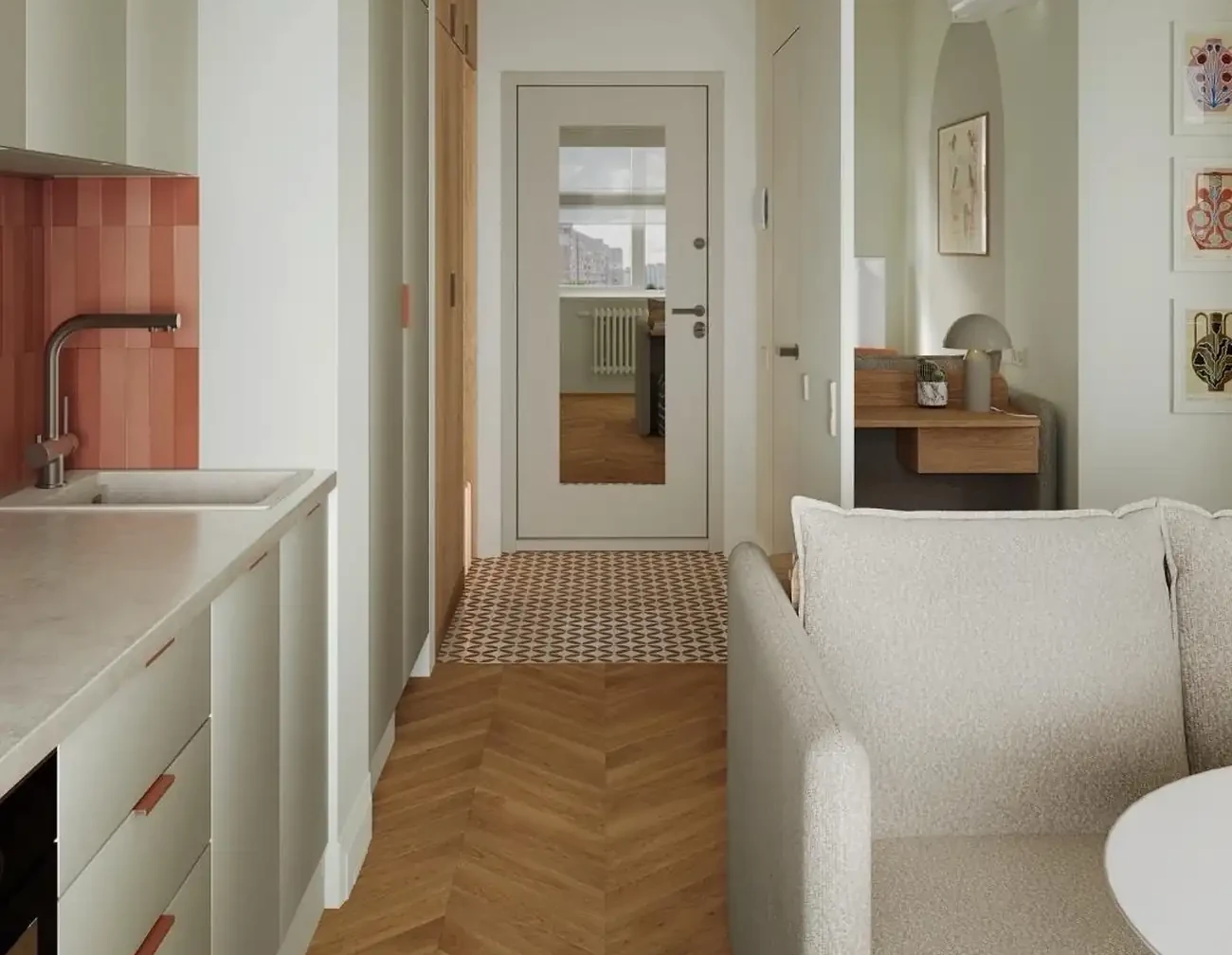
Even the entryway benefits from careful design. A light-wood panel framed in black serves as both a coat hook and a small shelf. A chest with a padded seat functions as a bench and storage for shoes. This attention to an often-neglected transitional space demonstrates the project’s coherence. Every square meter has been designed to provide storage without compromising aesthetics.
This type of light renovation resonates directly with the current global context. Many homeowners today are looking to transform a small home without undertaking major construction or applying for permits. Interior glass partitions remain a highly sought-after feature for this kind of project, as does boldly patterned wallpaper, which has made a strong comeback in our interiors in recent years.
Small urban spaces in major cities could take inspiration from this simple approach, selecting a bold color from a print, to unify a limited space without exceeding a reasonable budget.
This studio demonstrates that a cohesive design can make all the difference in how a space is perceived. Choosing the wallpaper as the color starting point remains the smartest decision of the project. It serves as the common thread for the entire color palette without requiring a large budget. The well-proportioned black glass partition elegantly solves the zoning issue.
Overall, this project stands as a model of smart renovation, thought out room by room, yet connected by a clear color scheme from start to finish.


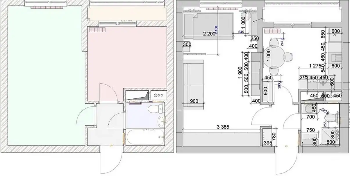
This apartment includes a main room, a separate kitchen, and a bathroom. The interior designer had to combine the bedroom and living room into a single open space. She also restored character to each room through color and materials. This kind of constraint requires setting priorities from the very beginning. Here, color served as the guiding thread rather than furniture or high-end materials. Here’s how the interior designer went about it, step by step. The decision was made here to keep the kitchen as a separate room without opening it up to the living room.
Zoning with a black glass partition
The main room had to serve two functions at once. It functions as both a bedroom and a living room. The interior designer created a division using a glass partition with a black frame. This choice warrants an explanation. A full-height glass partition would have been expensive and would have made the space feel visually heavy. This smaller, almost symbolic version is sufficient to mark the boundary between the two areas.
The result works because the transparency allows light to flow freely. The bedroom area benefits from natural light streaming in through the windows. Living room area maintains a more intimate and secluded atmosphere. The black of the frame is then echoed in the light fixtures, wall sconces, and coffee tables. This repetition of the black color creates visual cohesion between the two spaces. This is a simple, replicable example of low-budget zoning.
The glass partition creates a clear visual boundary while preserving the sense of space. It serves as a reminder that transparency remains the most effective ally for small spaces, far more so than a solid partition.
Wallpaper that set the entire color palette
In the sleeping area, wallpaper featuring a pattern of geese in flight adorns the wall behind the headboard. It also appears above the small desk, creating continuity between the two areas of the room. This graphic choice lends an almost theatrical flair, a far cry from the run-of-the-mill choices often found in small homes.
It was precisely this wallpaper that guided the rest of the project. The walls were painted in the exact shade of green found in the pattern. This method, starting with a print to extract a dominant hue, remains one of the surest ways to harmonize a room. The resulting sage green lends a natural softness to the overall look. It avoids the pitfall of uniform white, so common in small spaces renovated on a tight budget.
This method offers another advantage: it limits the number of decisions to be made, thereby reducing the risk of mistakes when working with a tight budget. Once the shade is chosen, it simply needs to be applied to the moldings, the crown molding, and certain pieces of furniture. The result immediately appears more polished than a decor composed of colors chosen separately, room by room, without an overarching design logic.
A living room warmed by dusty pink velvet
In the living room, a dusty pink velvet sofa immediately catches the eye. Its warm hue contrasts with the sage green of the walls, creating a very harmonious pairing of complementary colors. Cushions with graphic patterns, one polka-dotted, the other striped, add depth to the overall look. A sculptural black wall sconce almost serves as a work of art without breaking the bank.
The old rose warms up the green, which on its own might have seemed cold. The combination also works because the black of the structural elements, the glass roof frame, furniture legs, and light fixtures, contrasts with the colors.
Kitchen and its retro backsplash
The kitchen is separated from the main room and opens onto the loggia. The base and wall cabinets are painted a soft powder blue. Its light wood countertop was an almost obvious choice. The interior designer decided to remove the wall cabinets above the stovetop. As a result, the room appears significantly larger than it actually is.
The truly unique feature of this kitchen is its backsplash. Colorful tiles with geometric patterns, inspired by retro styles, cover the entire backsplash wall. It’s this detail that gives the room its distinct character.
This type of graphic backsplash is a surefire way to liven up a small kitchen. It catches the eye without requiring major renovations or changing the countertop. Paired with a pastel shade like this powder blue, it prevents a monochromatic kitchen from looking too plain. It’s a simple lesson to remember for anyone who wants to refresh an existing kitchen without starting from scratch.
The bathroom, the only room completely remodeled
The bathroom is the only space where the renovation was carried out in its entirety. A drop ceiling, recessed spotlights, white subway tiles, and a floor with a graphic pattern make up the new design. The bathtub has been replaced by a walk-in shower, framed in black, which is more practical for everyday use. This design choice makes perfect sense in a studio apartment intended for a single person, especially an older one.
Green reappears on the upper portion of the walls, directly echoing the rest of the apartment. This repetition of color creates continuity between the rooms, even though they are physically separate. The combination of classic subway tiles and a more contemporary patterned floor works well. It avoids the overly sterile look of a standard new bathroom, while remaining timeless.
The choice of a shower over a bathtub is also worth noting. It frees up floor space and makes it easier to move around in an already compact room. The black frame of the glass shower enclosure echoes the design language introduced by the living room’s glass roof. This continuity of materials, though subtle, reinforces the sense of a project thoughtfully designed as a whole.
The entryway, a space optimized down to the smallest corner
Even the entryway benefits from careful design. A light-wood panel framed in black serves as both a coat hook and a small shelf. A chest with a padded seat functions as a bench and storage for shoes. This attention to an often-neglected transitional space demonstrates the project’s coherence. Every square meter has been designed to provide storage without compromising aesthetics.
How can the decor of this 39sqm studio inspire us?
This type of light renovation resonates directly with the current global context. Many homeowners today are looking to transform a small home without undertaking major construction or applying for permits. Interior glass partitions remain a highly sought-after feature for this kind of project, as does boldly patterned wallpaper, which has made a strong comeback in our interiors in recent years.
Small urban spaces in major cities could take inspiration from this simple approach, selecting a bold color from a print, to unify a limited space without exceeding a reasonable budget.
Our take on this renovation
This studio demonstrates that a cohesive design can make all the difference in how a space is perceived. Choosing the wallpaper as the color starting point remains the smartest decision of the project. It serves as the common thread for the entire color palette without requiring a large budget. The well-proportioned black glass partition elegantly solves the zoning issue.
Overall, this project stands as a model of smart renovation, thought out room by room, yet connected by a clear color scheme from start to finish.


Comments